This Pan
Type:
mobile app concept
Tools:
Figma,
After Effects
Role:
Designer
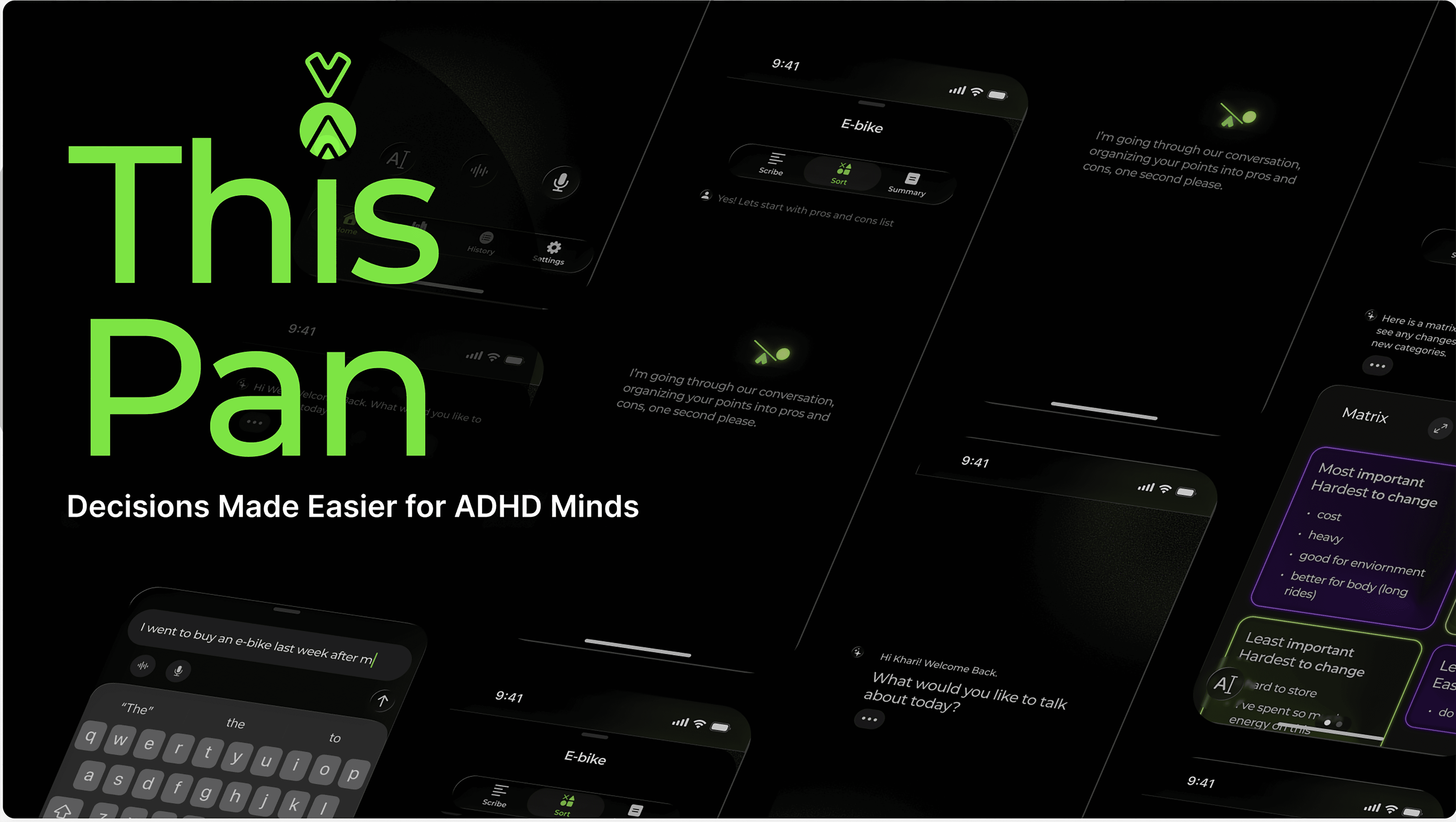
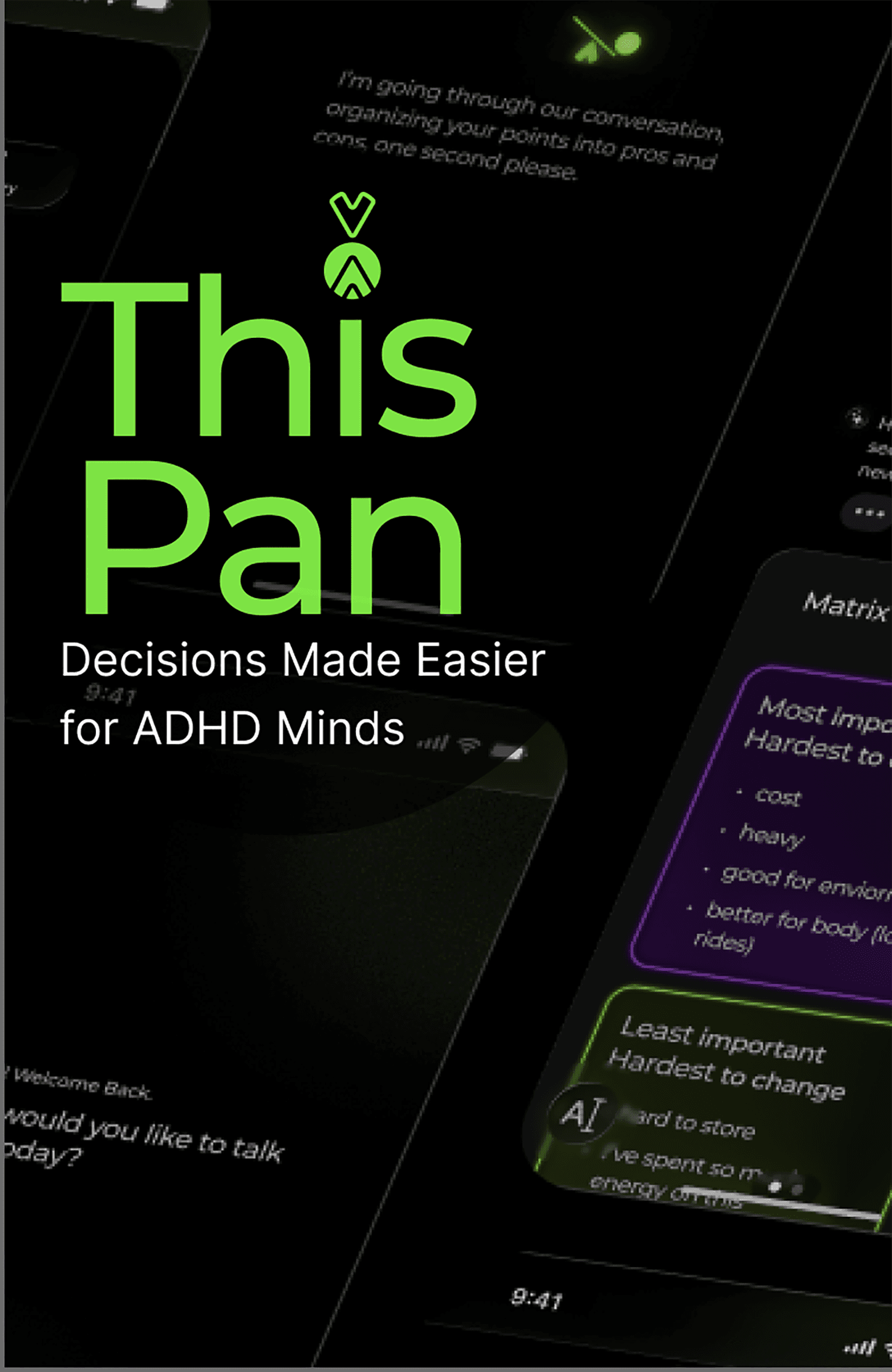
ThisPan offers a warm, interactive journal where supportive AI and simple decision-making tools help ADHD thinkers feel confident and less overwhelmed when making decisions.
We can all relate to the frustration and anxiety that come along with indecision. And, for people with ADHD, the experience is potentially all too familiar. This app concept was inspired by the desire to lend an easily accessible helping hand available whenever indecision strikes.
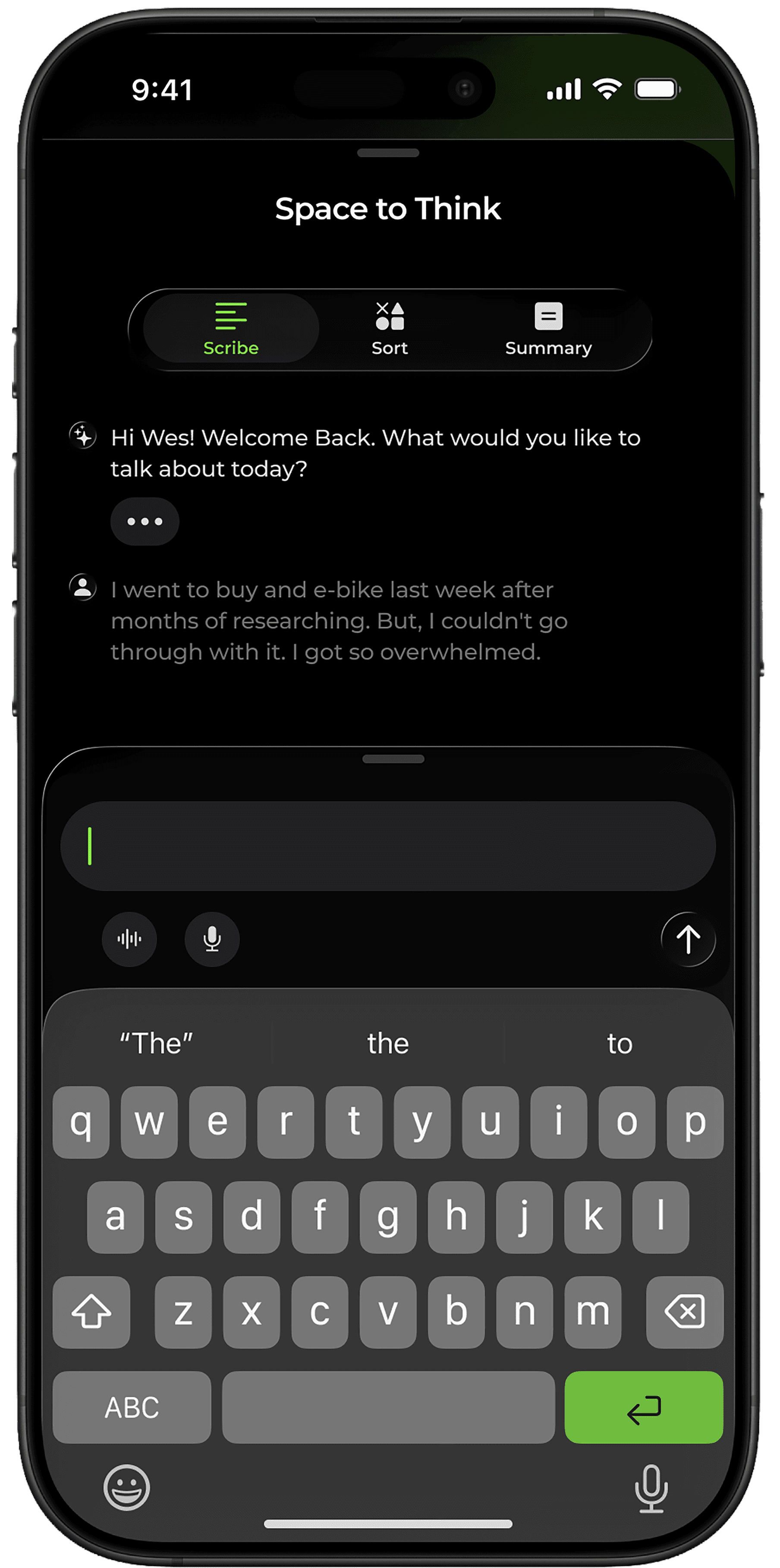
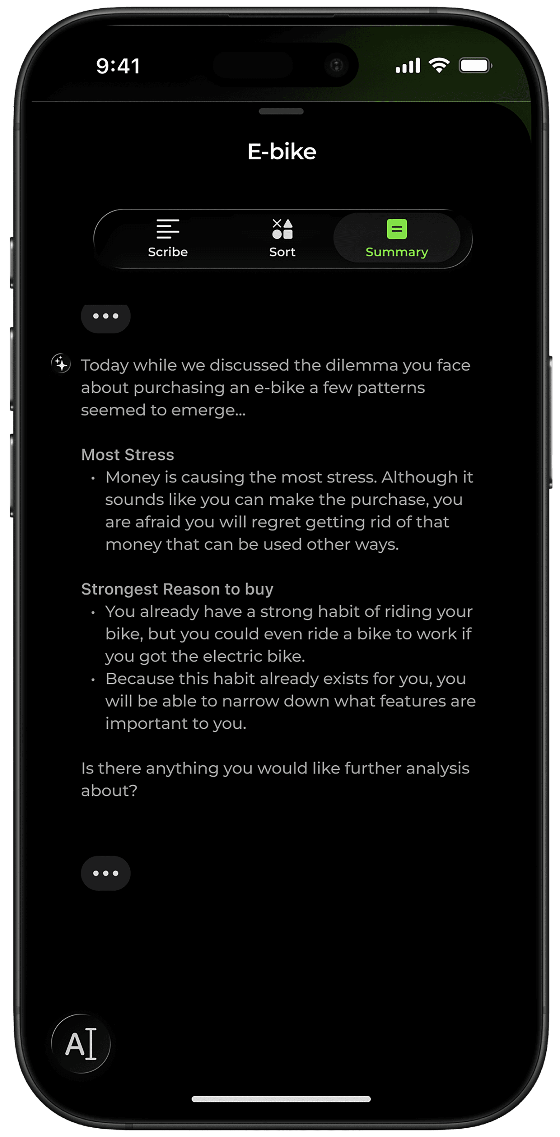
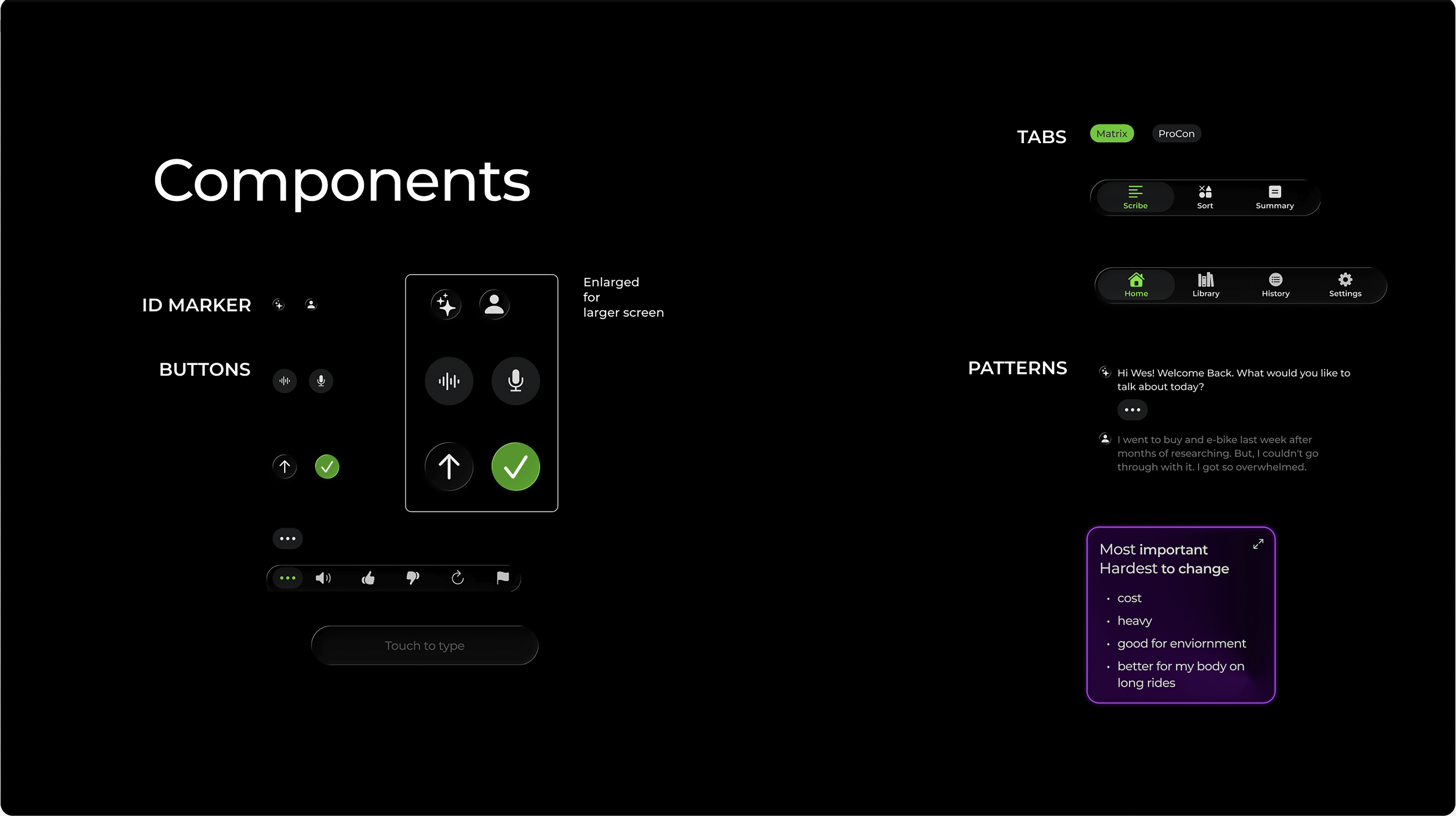
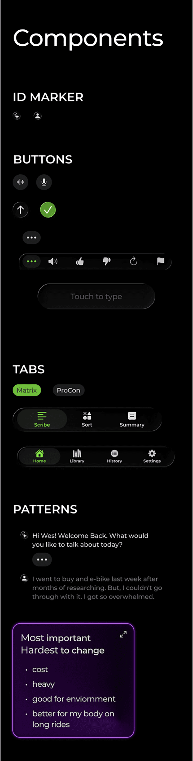
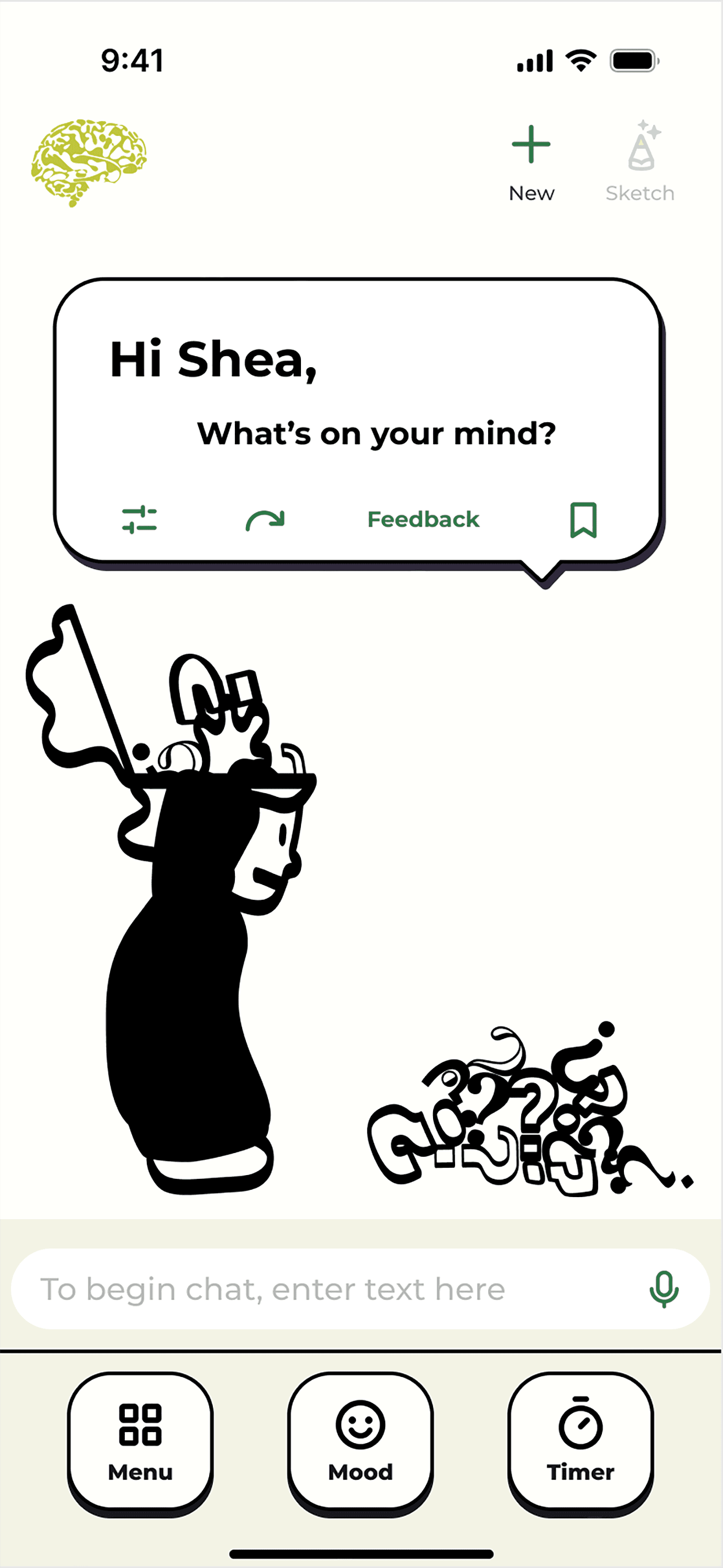
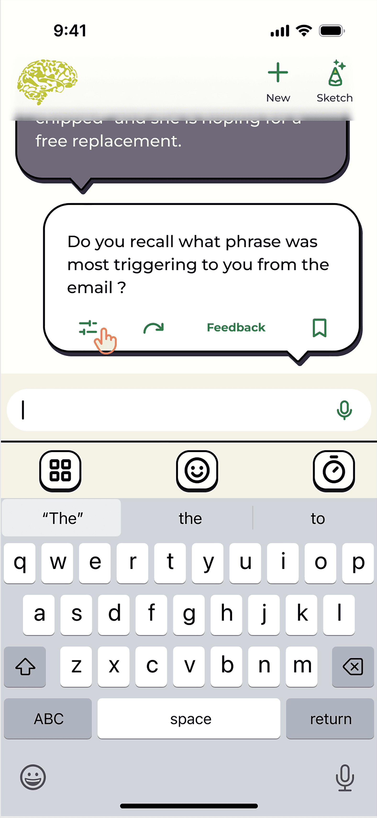
This demonstration shows a user interacting with ThisPan's AI interface using the keyboard. The user is interacting within the "Scribe" interface. Scribe is named so because it is the transcript of the conversation, the best way to view the complete conversation.
Visual sorting elements are organizational structures such as lists or matrixes. These elements grow and shrink for optimum viewing size.


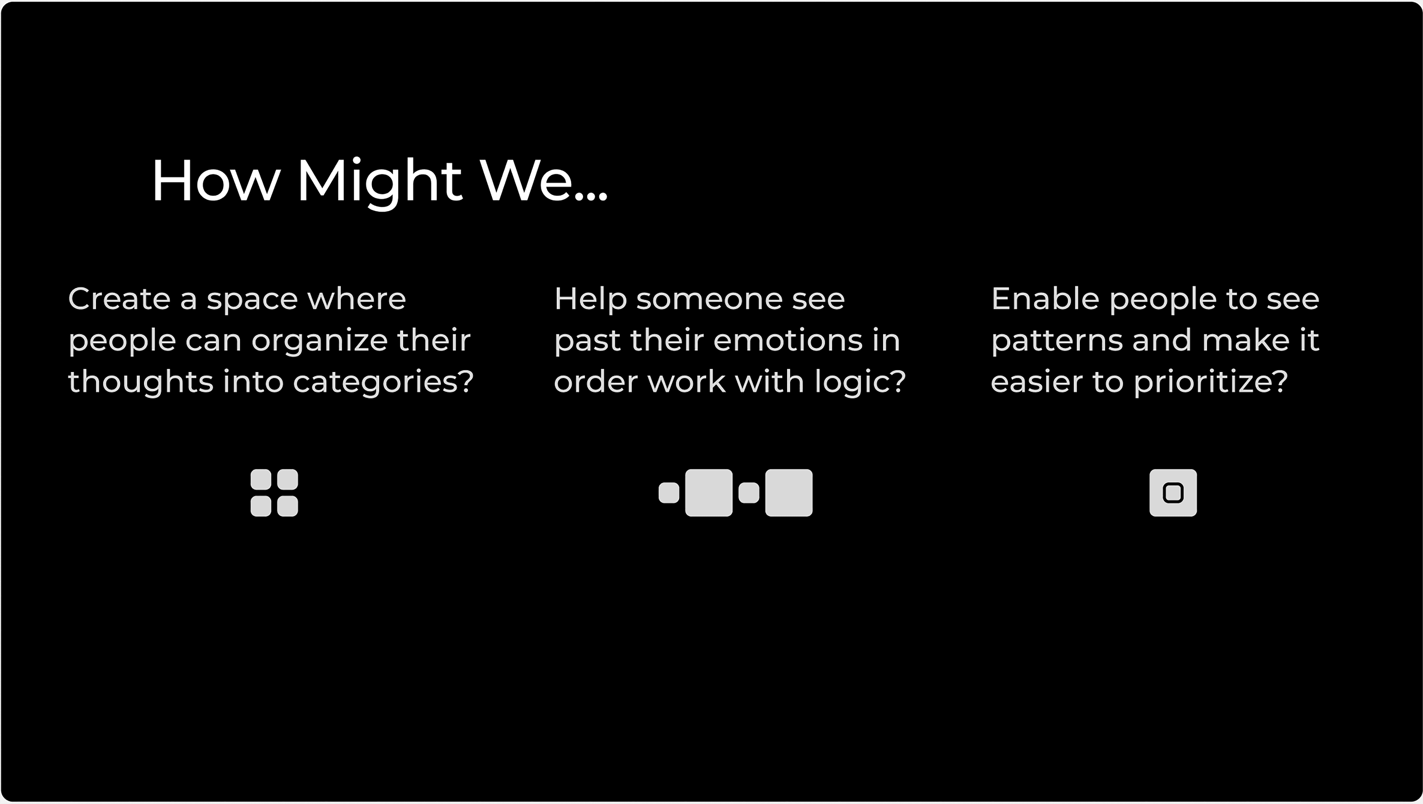
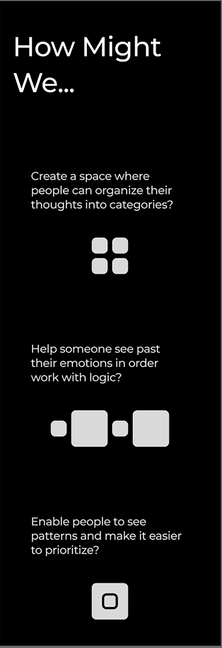
Targeted Problem
Coping with ADHD is naturally cognitively demanding as a result of issues with executive function. One of the results of this kind of brain fatigue is difficulty making decisions.
Many people experience similar symptoms that increase the difficulty of making decisions, such as:
working memory deficits
impulsivity
overthinking
difficulty prioritizing
emotional dysregulation
trouble anticipating longterm outcomes
User Scenario

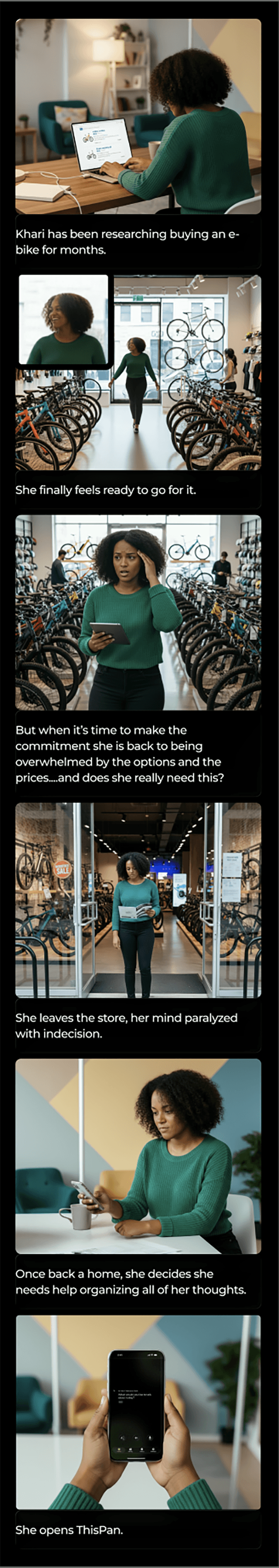
From participant interviews and conversations with friends and family, I've gathered that the more someone struggles with indecision, the more likely they are to experience feelings such as low self-esteem or shame, try to mask it, or worry about burdening others with their problems.
ThisPan is not intended as a replacement for genuine human-to-human conversation with a friend or therapist. However, those options are not always accessible -that's where ThisPan fits in.
Features

Type
Converse
Speak
3 communication options
Type Mode: Use the keyboard to communicate your message and read the generated responses.
Converse Mode: Both the user and ThisPan speak to each other conversationally.
Speak Mode: The user speaks, but reads the responses.
The conversational format uses AI to help organize and clarify the user's shared thoughts and concerns. The variety of communication options increases the accessibility for both ability (physical and mental) as well as the user's current environment (example: don't want to be overheard vs being home alone).
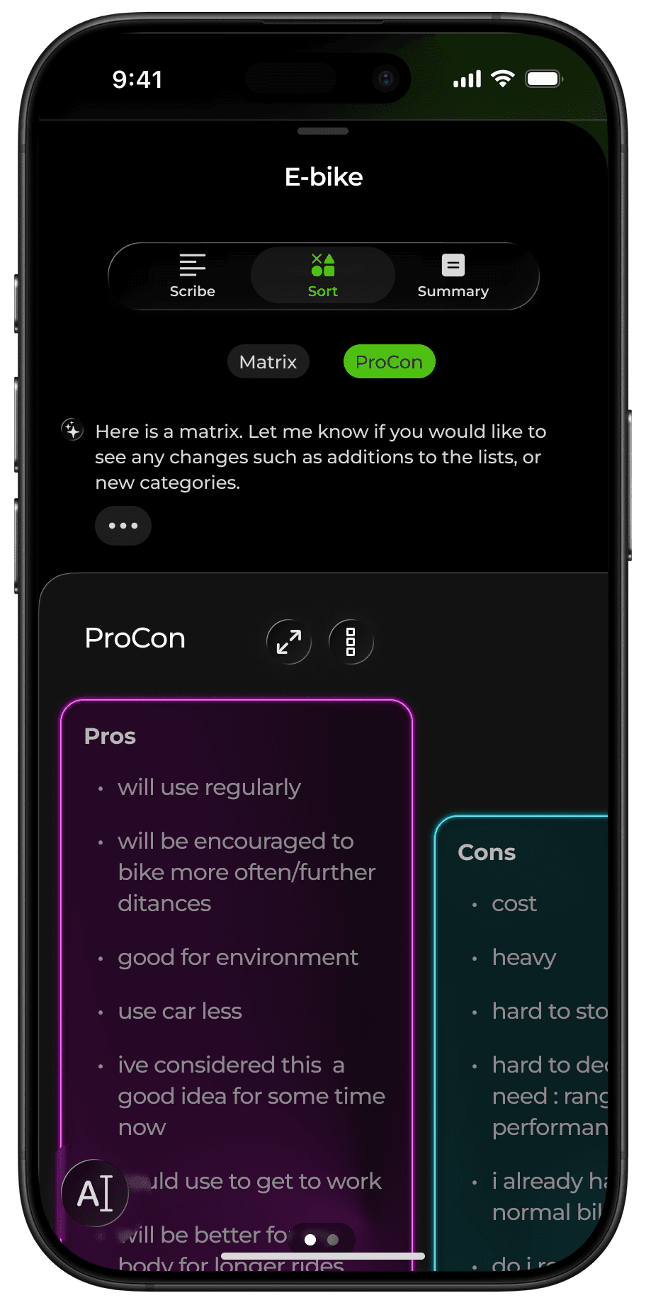
3 Processing Styles
Scribe: The full transcript of your conversation, as you would see in a standard text message platform.
Sort: Users can organize their thoughts into patterns that are easier to take in. Examples include: a pros and cons list, a matrix, or a word map.
Summary: ThisPan summarizes the conversation, detects patterns, often revealing a new perspective on the situation.
All our brains work differently. The versatility of processing styles - conversational, visual, and summarizing- amplifies the likelihood that a user will find a method that suits them best.
Styles
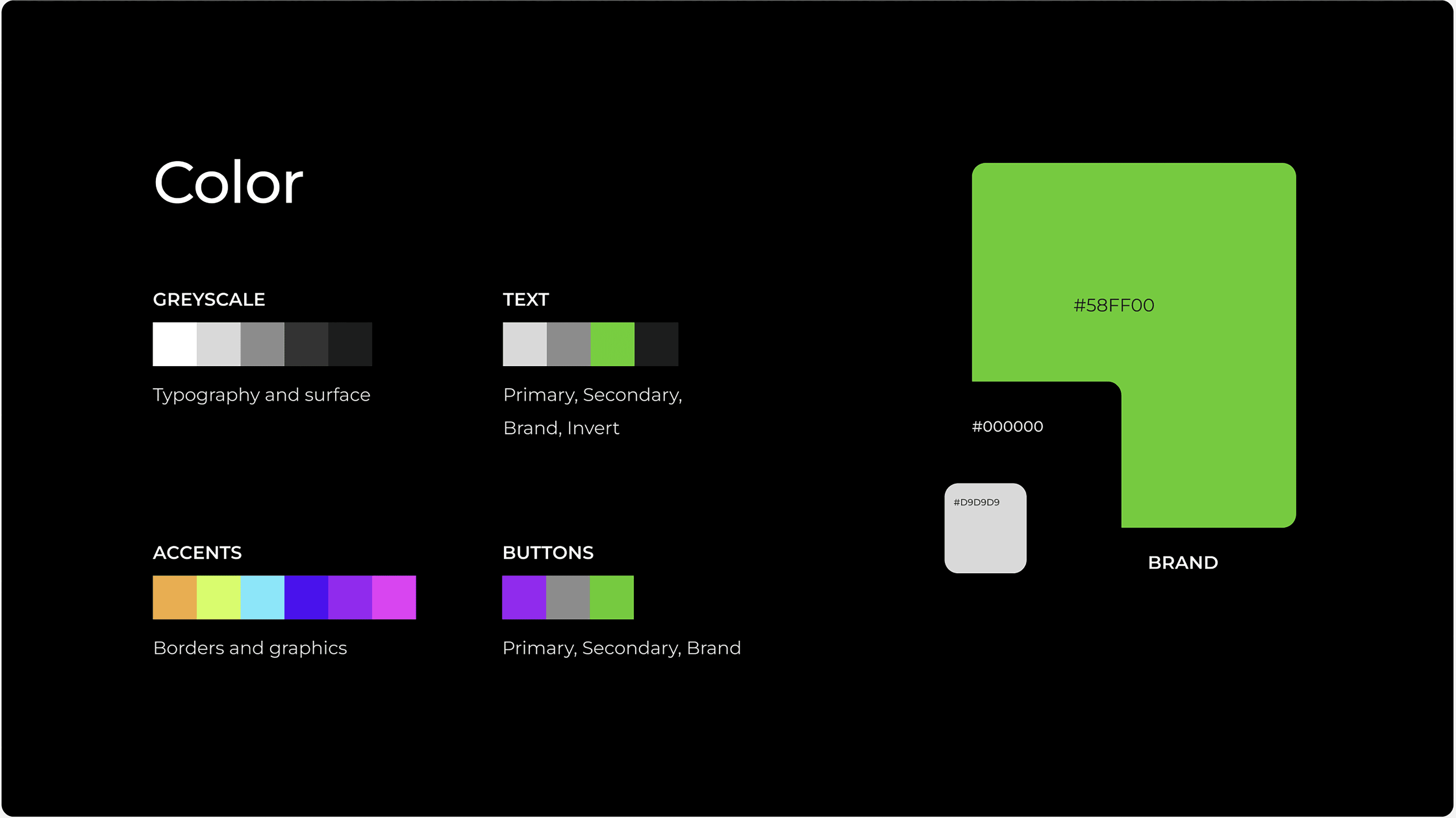
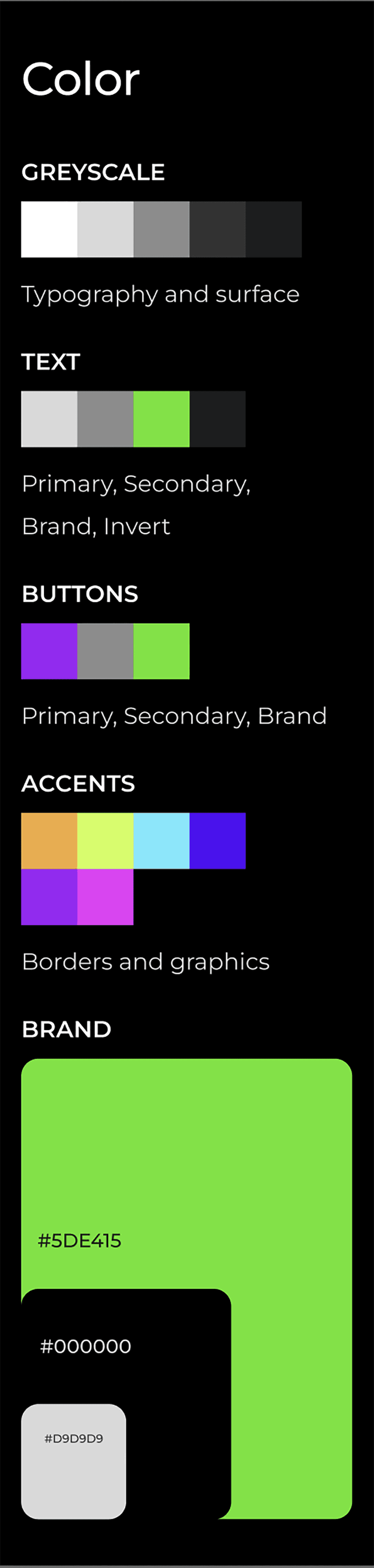
The dark background is intended to help users focus, while green is associated with growth. The intention of the application is to grow the user’s ability to make decisions.
The vibrancy of the brand and accent colors is stimulating, a reward to users whose brains are (if they have ADHD) most likely craving dopamine. The vibrant coloration and luminosity also suggest futuristic technology, a theme that currently feels appropriate as the world embraces AI technology.

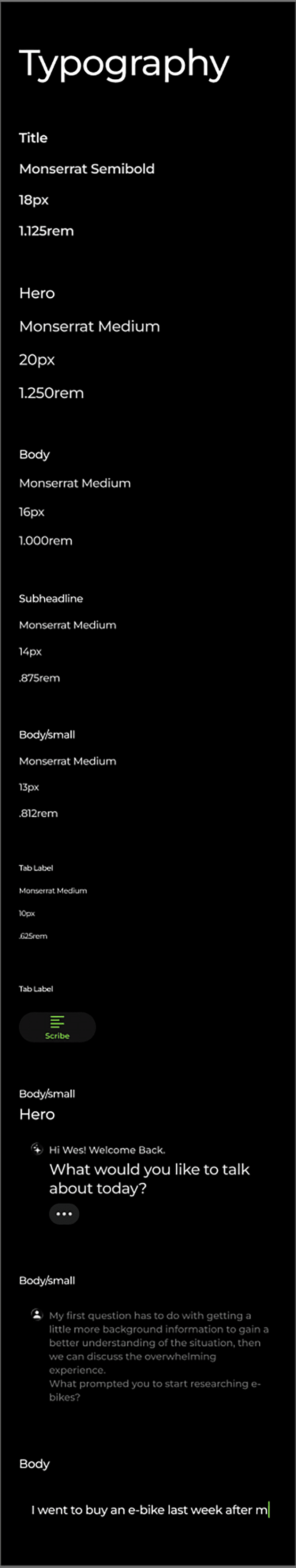
Monserrat is a geometric sans serif designed by Julieta Ulanovsky. Those perfect circles and smooth curves are so gentle and inviting, exactly the environment we want when we are seeking help. These letters each have all the space they need, no pressure to condense into a smaller space. I hope this translates into a feeling of comfort and calm.
Design Explorations
Sort Views
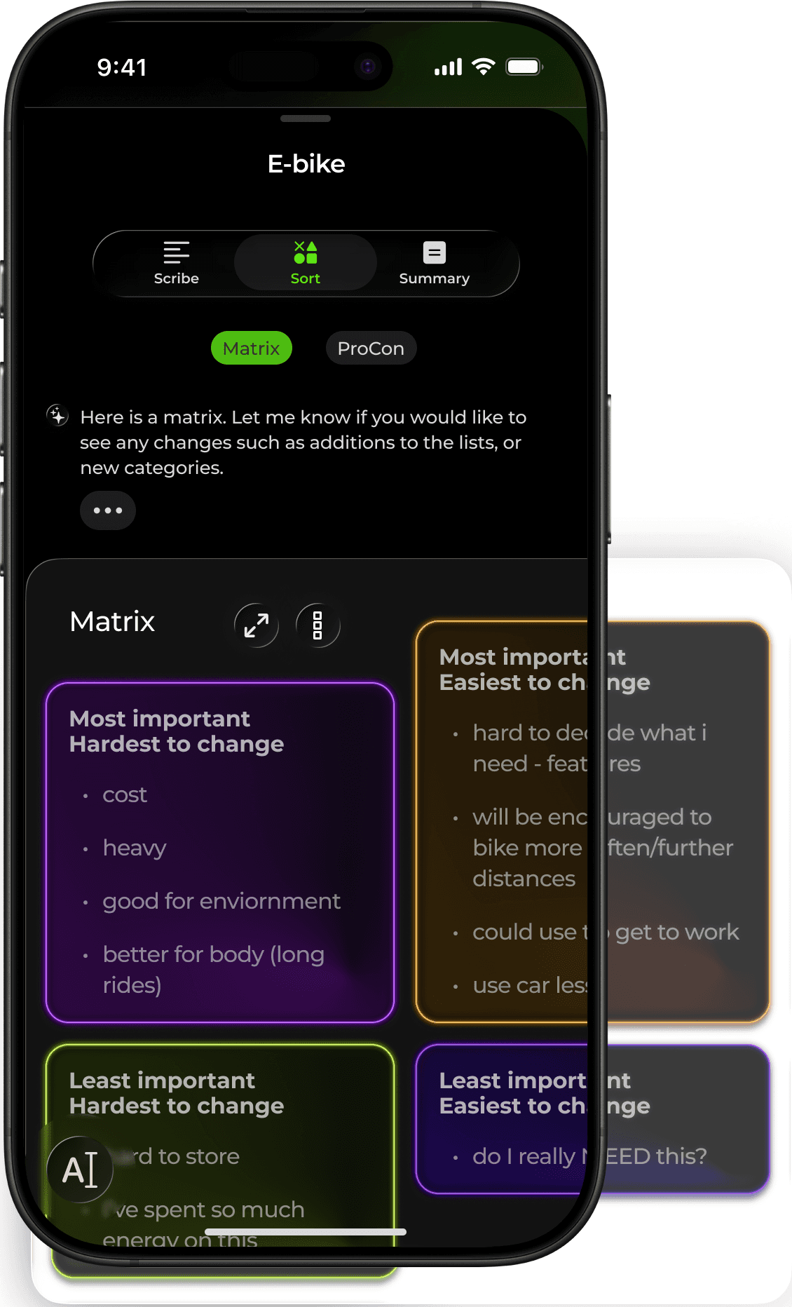
The sorting feature will lose its powerful impact if the information being sorted is not easily absorbable at a glance. Text size, contrast, hierarchy, and white space must be balanced so that minimal effort is necessary to interpret the information that has been sorted.
The default view is sized to fit within the window of the current user flow, enabling the user to understand where the sort element is located within the application. The user can use 2 fingers to zoom in or out, as well as scroll horizontally and vertically to view the entirety of the sort element.
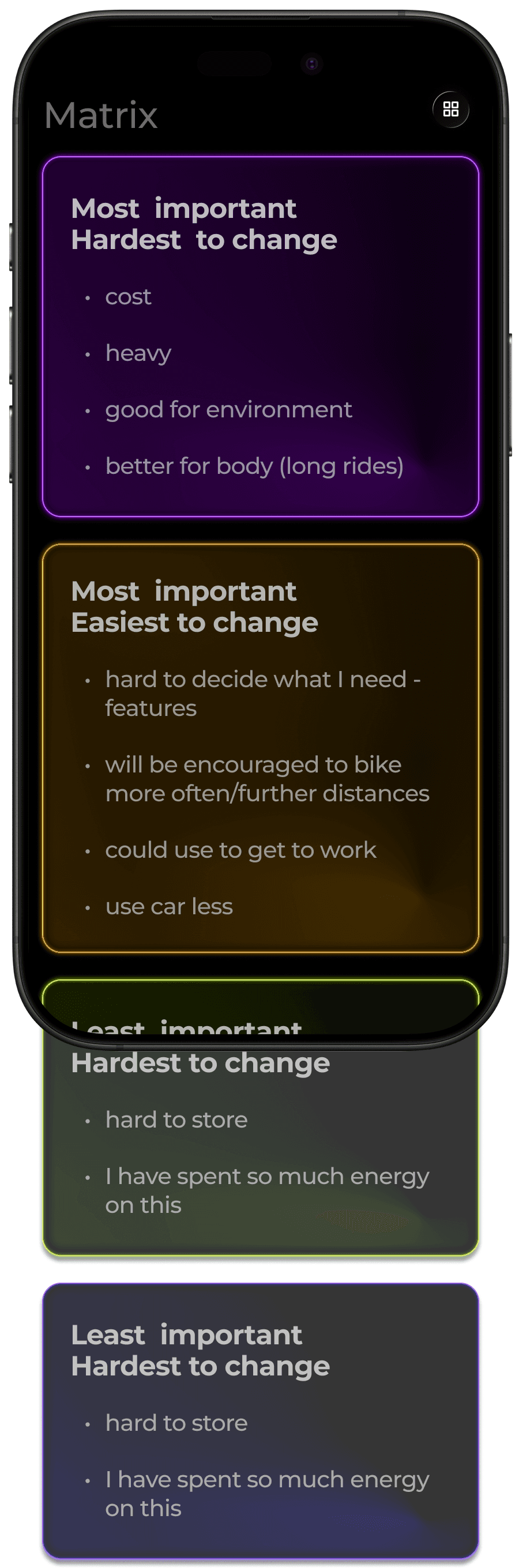
When it comes to enlarging the sort element, one option is to switch a horizontal stack to a vertical, with each list filling the horizontal width of the screen. This gives us a larger view, and the user now only has to worry about scrolling in one direction.
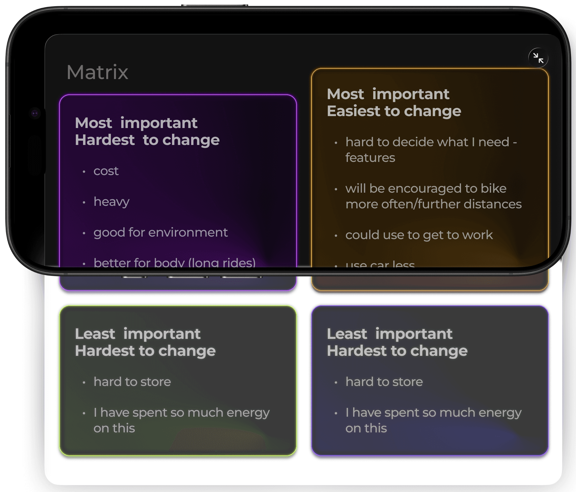
The position of information can also impact the ease with which it is absorbed. For example, in the case of a matrix, seeing bullet points organized in the quadrant format could affect the impact the sorting has once it's processed in the user's brain. Perhaps the linear stacking format would be more helpful to another user.
EArly Iteration
This earlier concept maintained the end goal of easing the burden of decision-making with a focus on ADHD minds. However, the approach was quite different, with an emphasis on the emotional toll indecision can take.
The design evolved around using artistic visuals (sketches) as a medium to help emotional processing, increase focus, and deliver delight.
At the time, over half of my sample group had negative feelings about the use of AI, especially concerning its use for help that entered into the realm of psychological.
The partial aversion to high-tech mixing with emotions inspired the styles to take on humanistic and physical qualities. I leaned into the idea of a sketchbook - the background an off-white color of paper and sketches drawn in one color as if done with a marker.
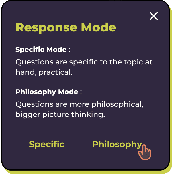
As in the latest version, the application is based on a conversational interaction with AI trained on trusted psychological methods and principles. However, in this earlier case, it would mostly communicate with questions, inspired by the Socratic Method. This idea sought to empower the user get to the bottom of their indecision, answer their own questions, and be prompted by external questions to trigger a new perspective from which to view their issues.
Users could decide the level of depth that the questions targeted based on the issue at hand - practical, a more concrete line of questioning, or more philosophical in nature.
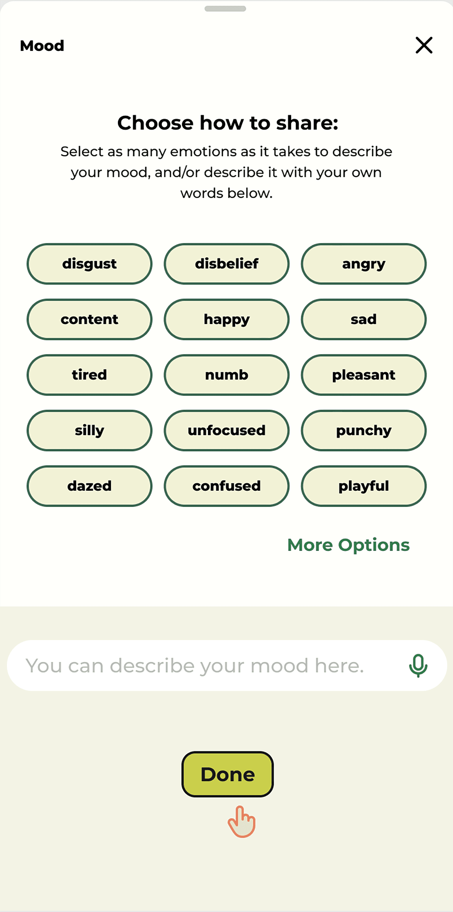
Users were encouraged to log their moods. Logging at the beginning and end of a session could give the user tangible evidence of the effects the app had on their decision-making processes and emotional states.
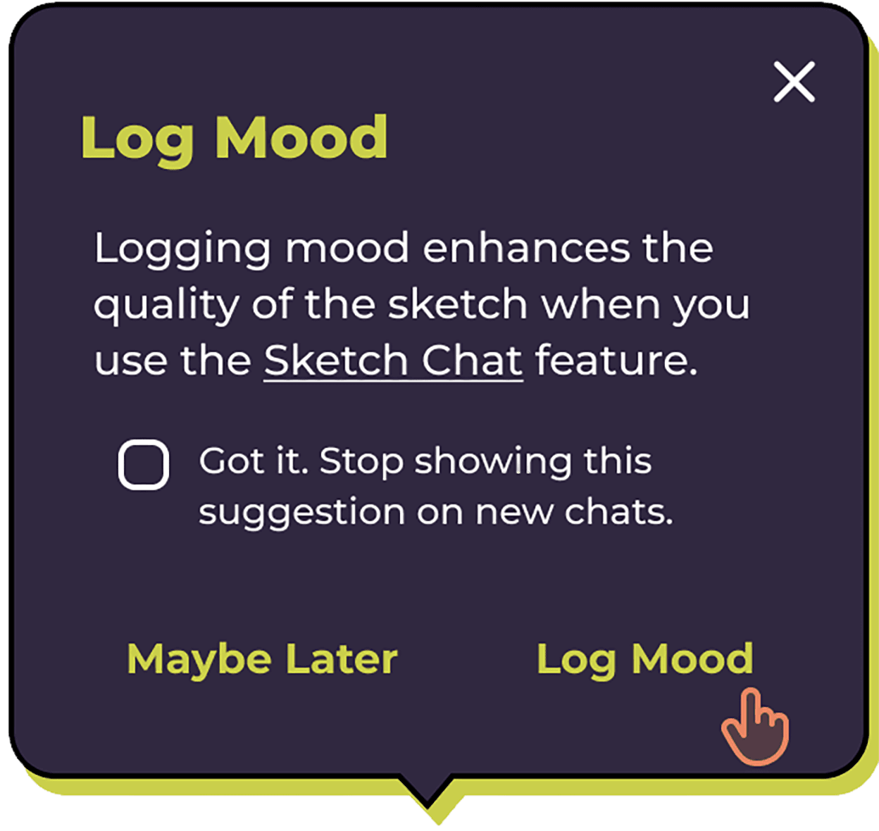
Logging mood would also give the image generator more information to work with when it comes time to generate a sketch of the chat.
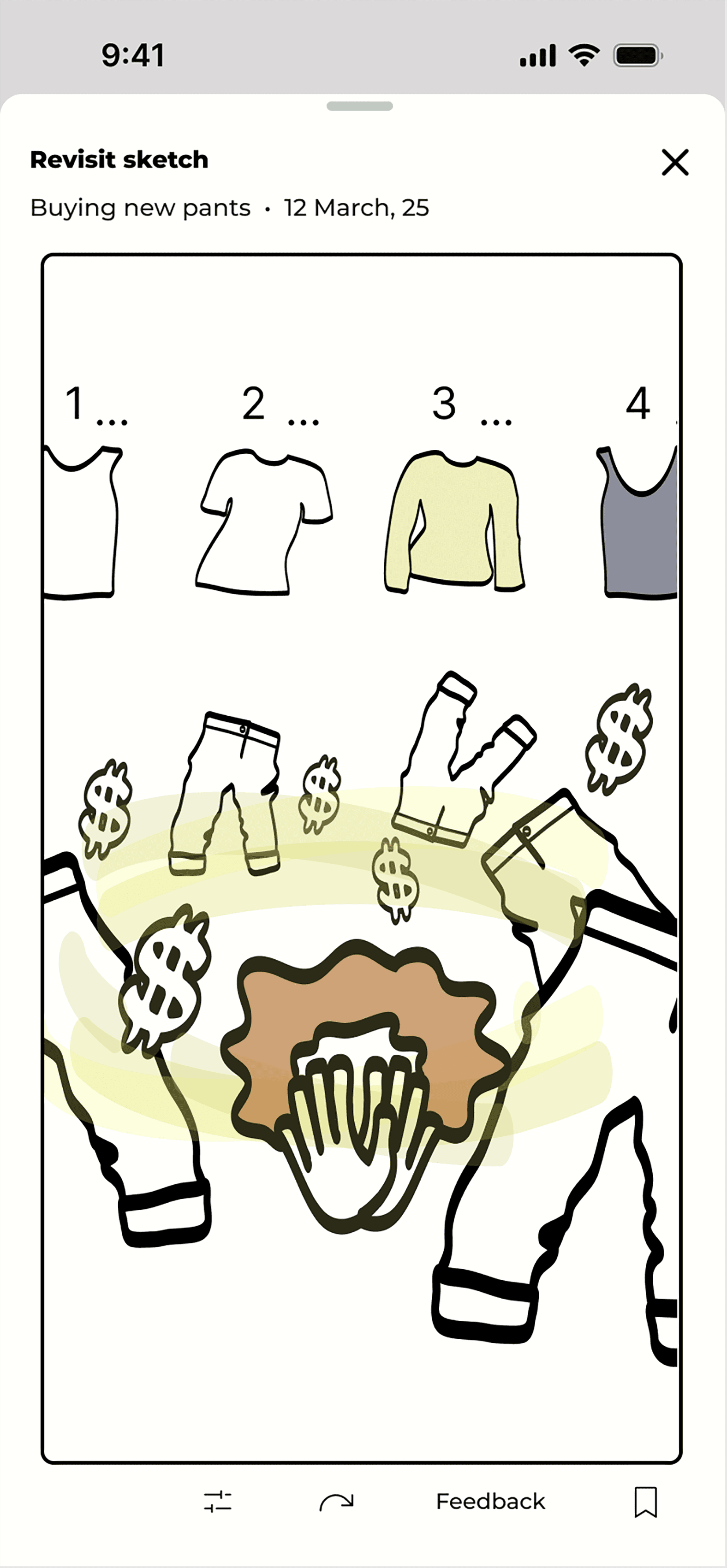
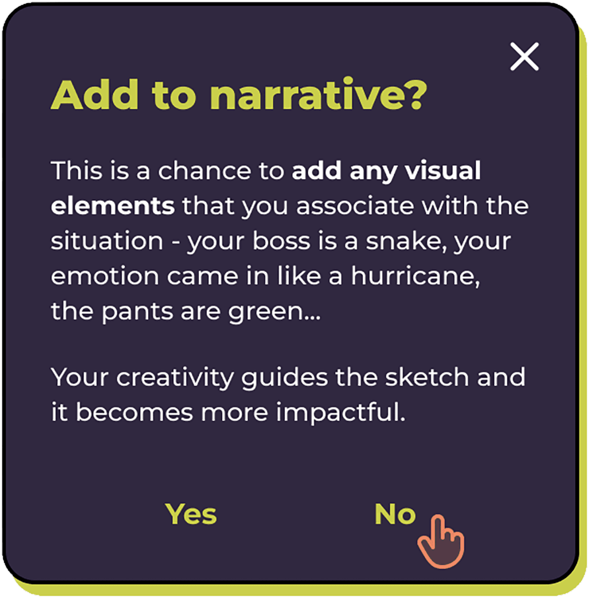
The sketch feature generated a sketch of the chat, including logged moods and added narrative, if provided. The "add to narrative feature" was an opportunity for the user to put their creative input into the sketch. It was also an opportunity to have a little fun.
Sketches were intended to summarize the problem and any helpful actions or steps to take. The concept was based on studies about the link between processing emotions and interpreting/creating art.
The latest version is a simplified and more straightforward approach.
Ultimately, our technology for AI image generation is not yet nuanced enough to meet the level of interpretation for the sketch feature to be effective.
But more importantly, helping people organize their thoughts is a more practical and effective approach to helping people get through their indecision.
In less than a year, people have become more accustomed to using AI. It no longer feels necessary to avoid a "digital" or futuristic look. I wanted to utilize a true black background since the technology on many phones has the pixels "turned off" in black areas, a small step designers can take to help with device longevity and less energy consumption.