Roo
Type:
mobile app concept
Tools:
Figma,
Visual Electric
Role:
Designer


Deciding what to make for dinner ("the dinner dilemma") is an inescapable part of life, like doing the dishes, but it shouldn’t be such a drag. Roo was designed to ease that daily friction by combining AI technology with intuitive planning tools.
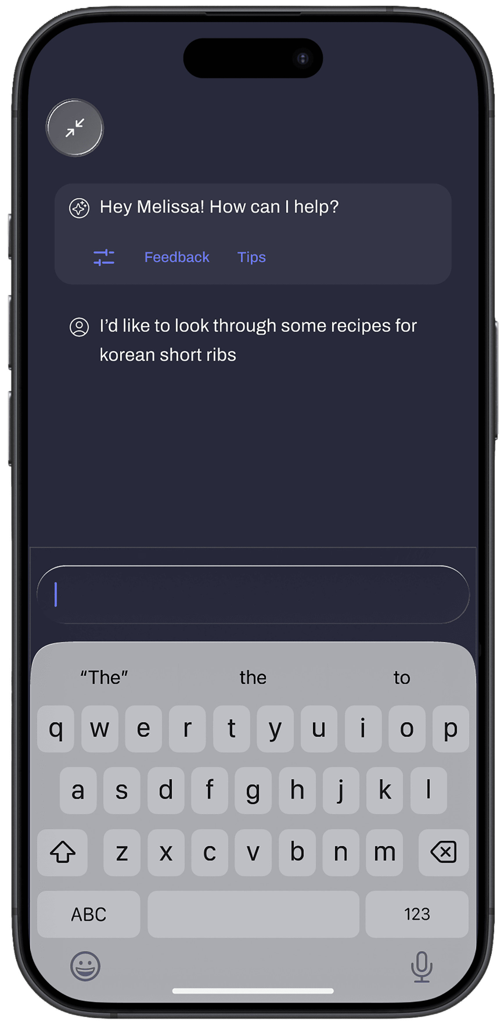
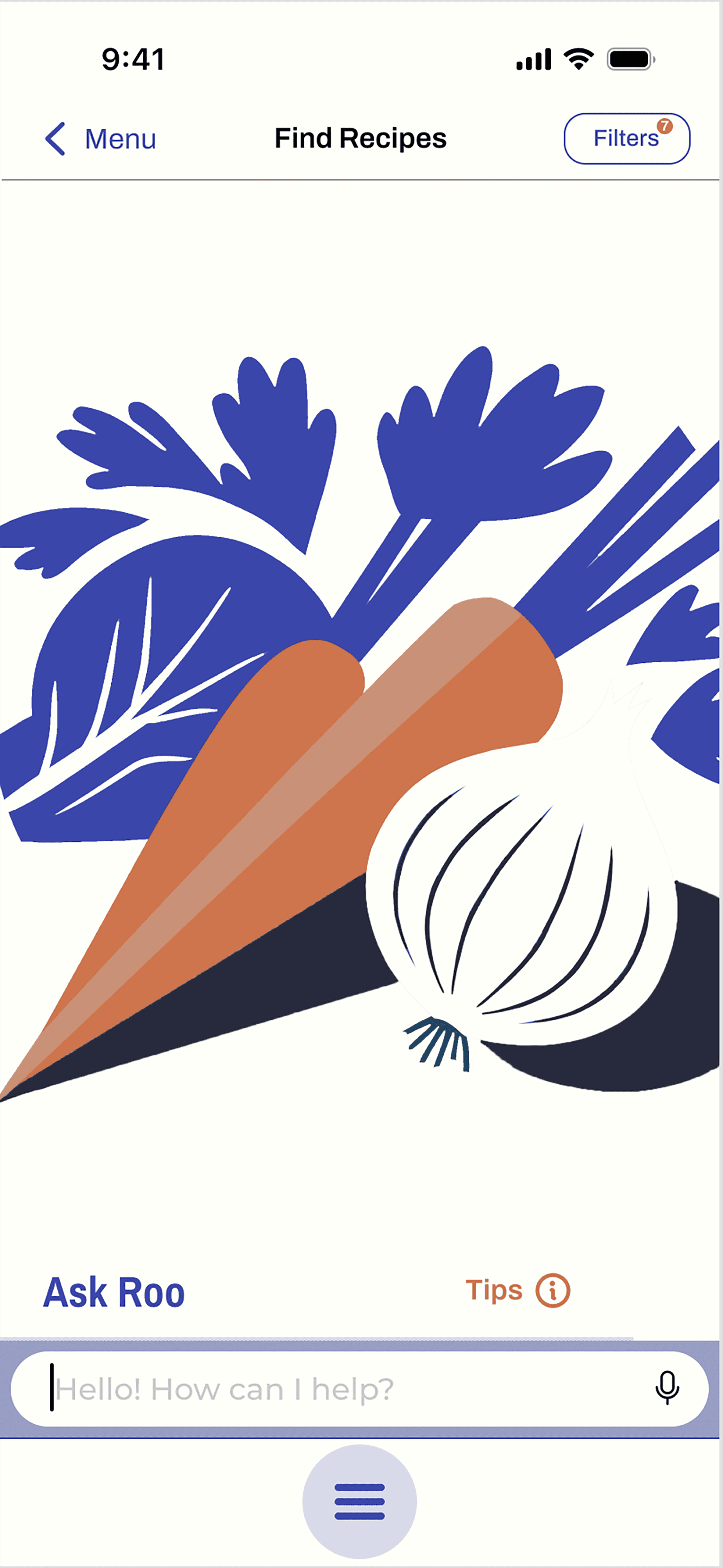
This prototype shows a user finding a new recipe. First, they check their filters and proceed to chat with Roo. Roo brings up a list of recipes, and the user selects one. Next, the user adds some items from the ingredients list to their grocery list and finally adds the recipe to their weekly plan.
Features
Search for recipes
Roo offers multiple ways to discover recipes:
Automated list of recipes to inspire your search,
Have a conversation with Roo about what your looking for,
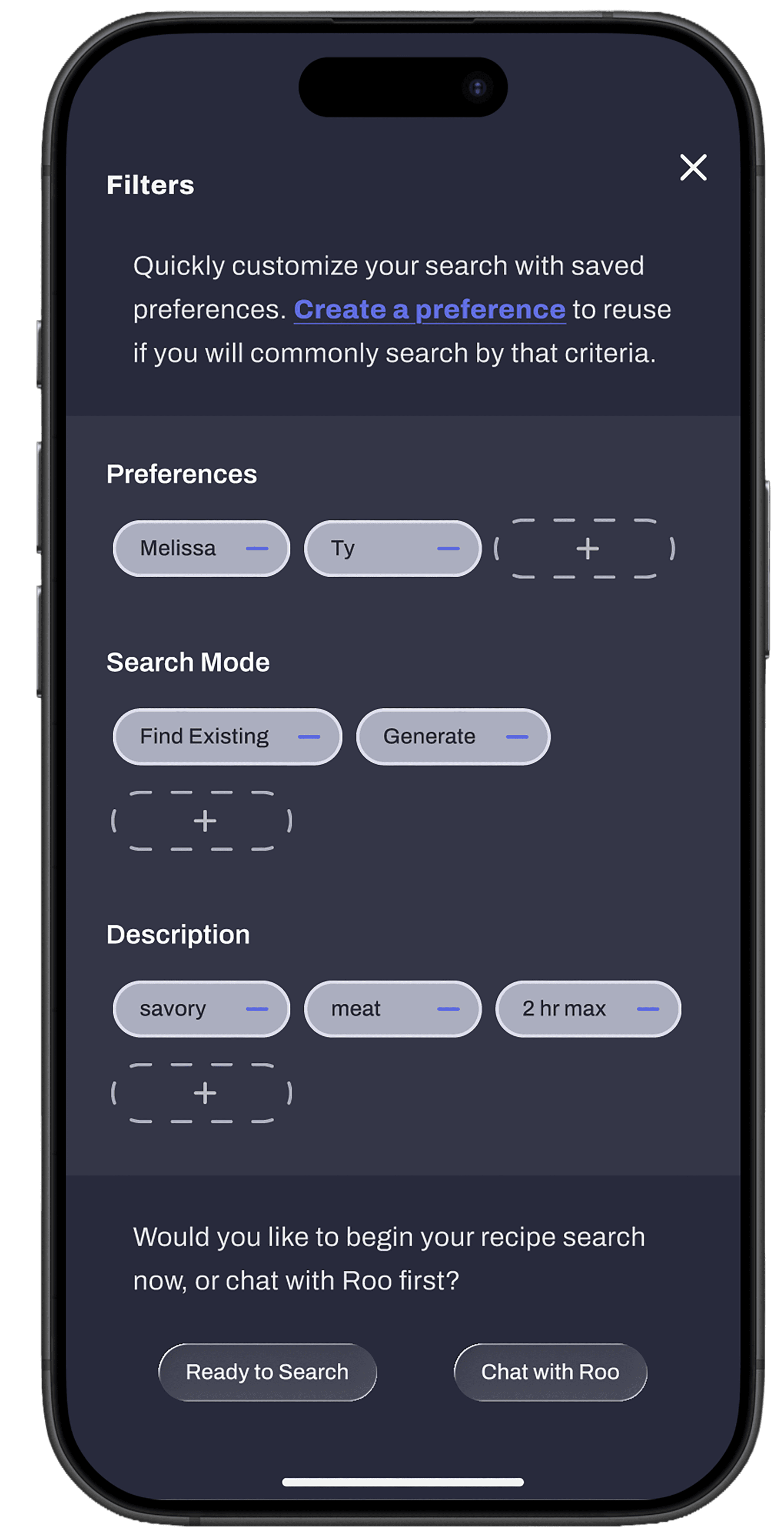
Create and save preferences that can guide the search.
My survey results showed that lack of energy, time, and inspiration are the most identified reasons people enter the "dinner dilemma".
The auto-generated list of inspirational recipes is one approach to sparking that needed inspiration.
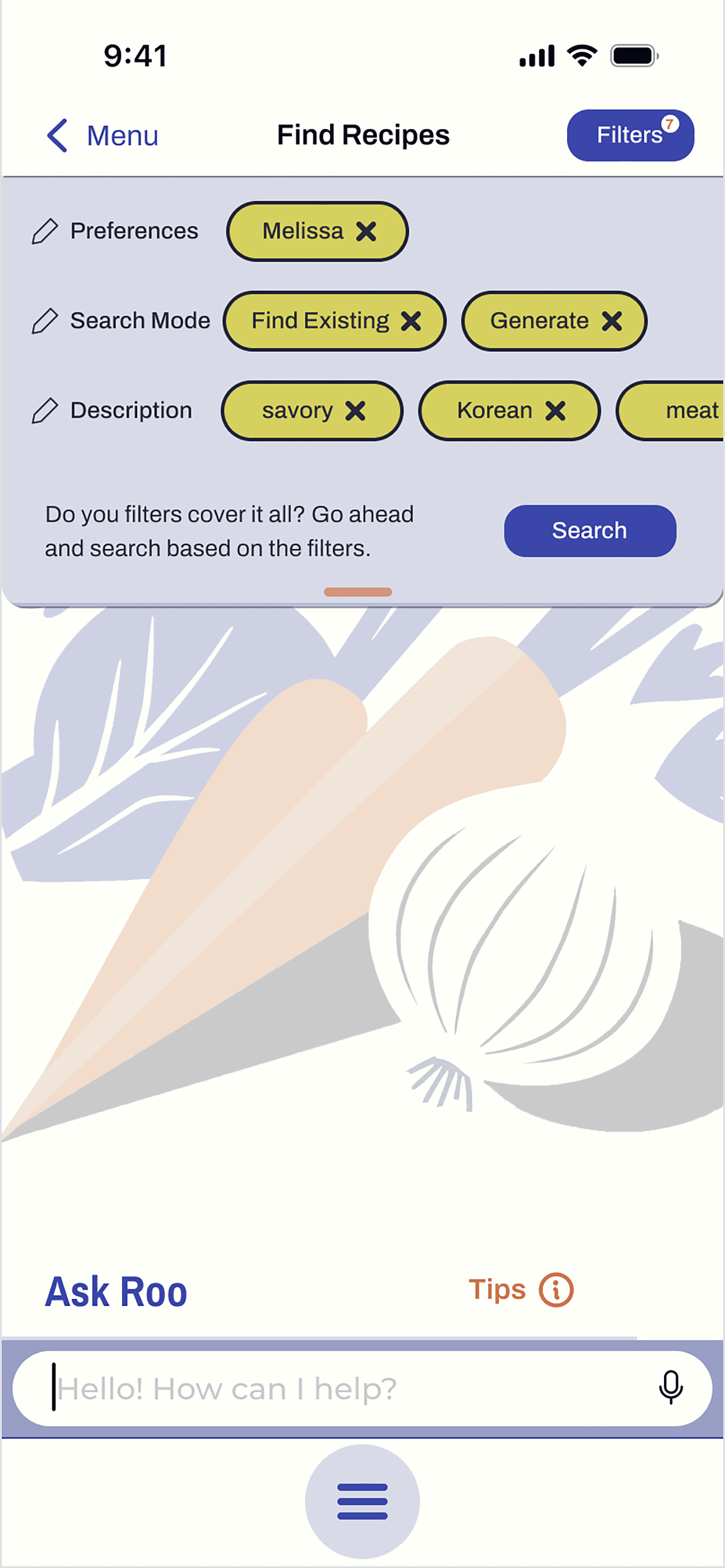
The ability to create personalized filters is time saving technique to aid the search process. The idea is to save preferences that the user will use over and over. Examples include: dietary restrictions, favorite foods, calories, and cuisine.
Within filters, the option also exists to enter descriptive words for the user's current search. This option, coupled with another option to limit recipes to those found on the internet while excluding AI-generated recipes, exists because I found that many of my survey participants had mixed feelings about AI.


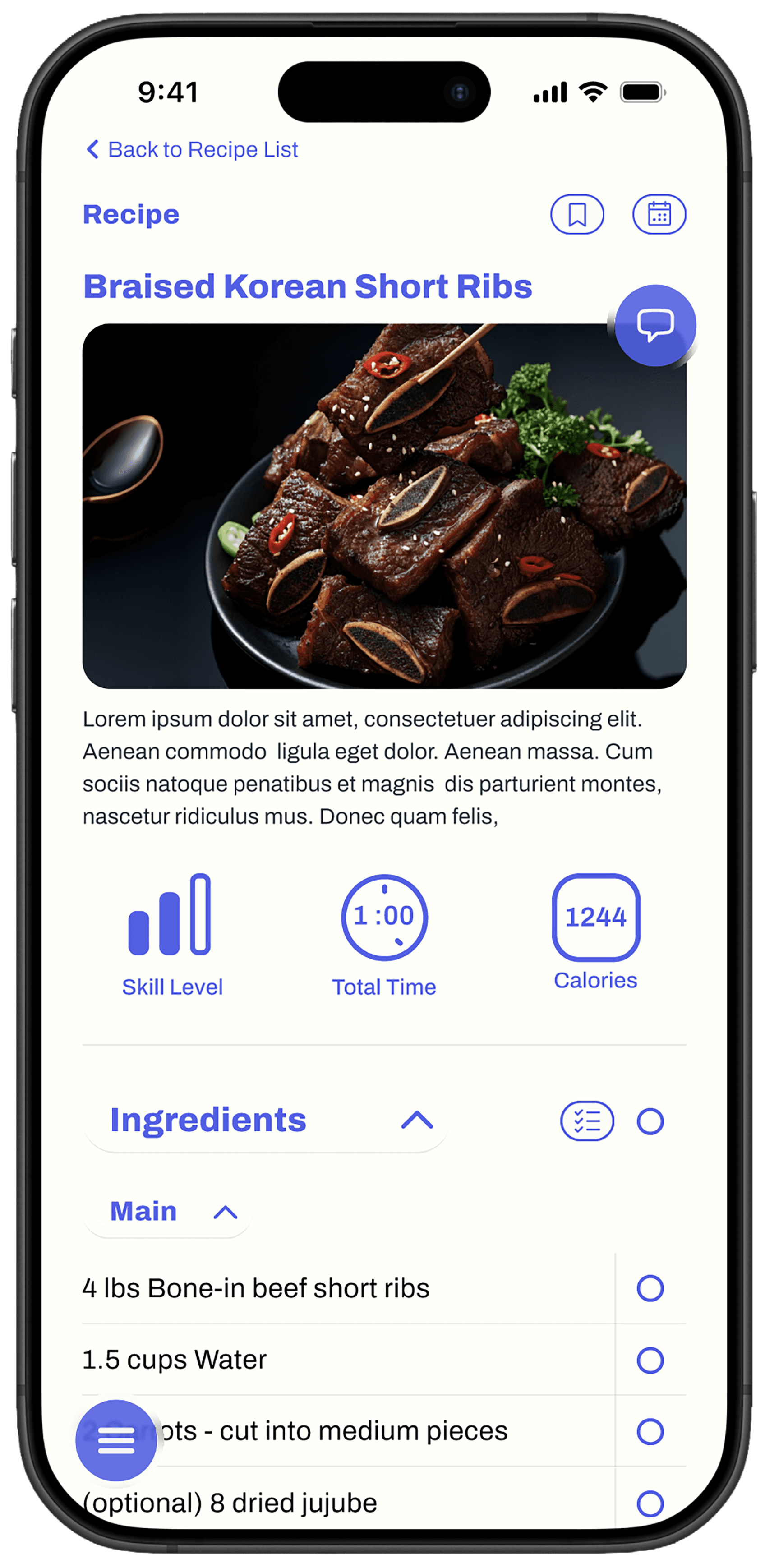
The recipies
The recipe features a quick reference of customizable "quick look" highlights about the recipe, such as skill level, time to make, and calories.
The ingredients and instructions can be hidden or expanded to facilitate movement around the page.
Ingredients can be instantly add to the grocery list.
The instructions highlight actions, ingredients, and times for easier scanning.
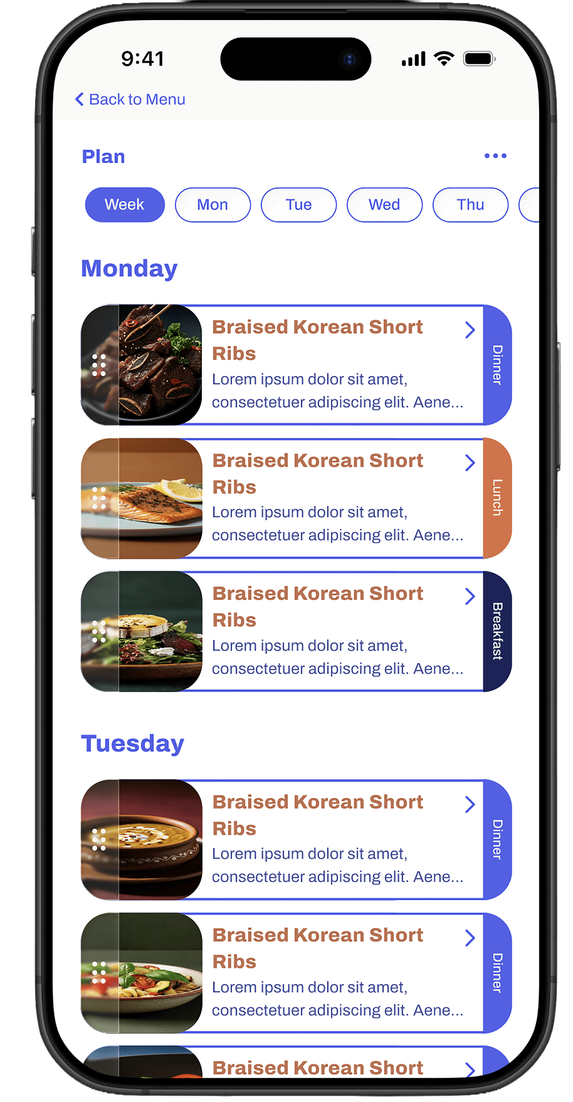
Make a plan
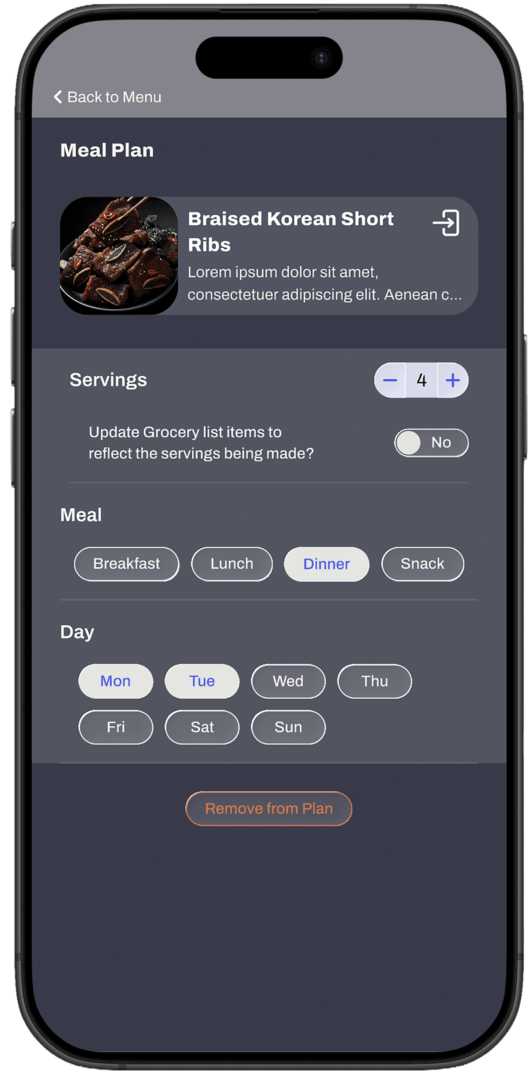
Recipes can also be added to a weekly plan. Select to view the week or individual day. Drag recipes to reorder. Distinguish which recipe you plan for each meal of the day.
Having ingredients at home when it's time to make a meal was another common struggle for many survey participants. The grocery list and planning features are both designed to make a trip to the grocery store more effective, hopefully with fewer trips to the store.
Styles


Color
Since blue is associated with calm, it seemed like a wise choice to accent an app aimed at transforming an often frustrating event into a smoother experience. In the same vein, I avoid true black and white for a softer, more gentle feeling.
Brand on Dark: #D7D045. Replaces Brand blue on dark or inverted background.
“Black”: #282A3D. Used for body copy on light backgrounds, and as the invert/dark background color.
“White” #FFFFF8. Used as background color or body copy over invert background.
Accent #C36F50. Used to call attention to elements such as inline links or badges.

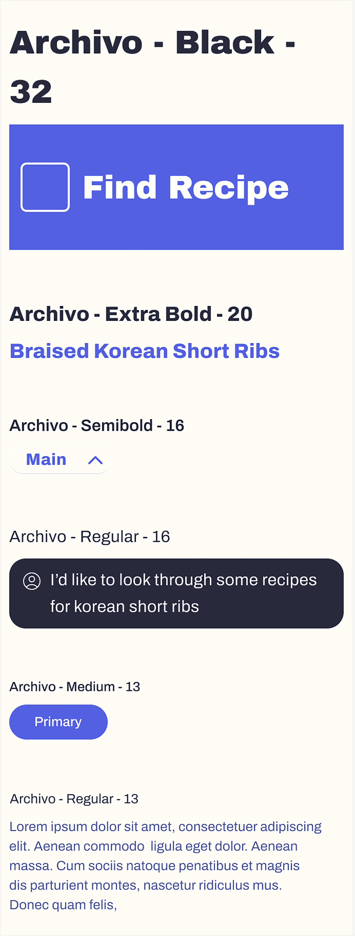
Typography
Archivo is a grotesque sans serif from Omnibus-Type that offers a broad range of weights, which makes hierarchy a breeze. The letters have a rectangular shape with rounded corners. The repetition of this shape is dependable, the predictability calming. The x-height is roomy and open, which often feels friendly and welcoming.
It was important to choose a typeface that is experienced as welcoming and trustworthy, as if to say, “come to me, friend, I’ve got your back.”
Components

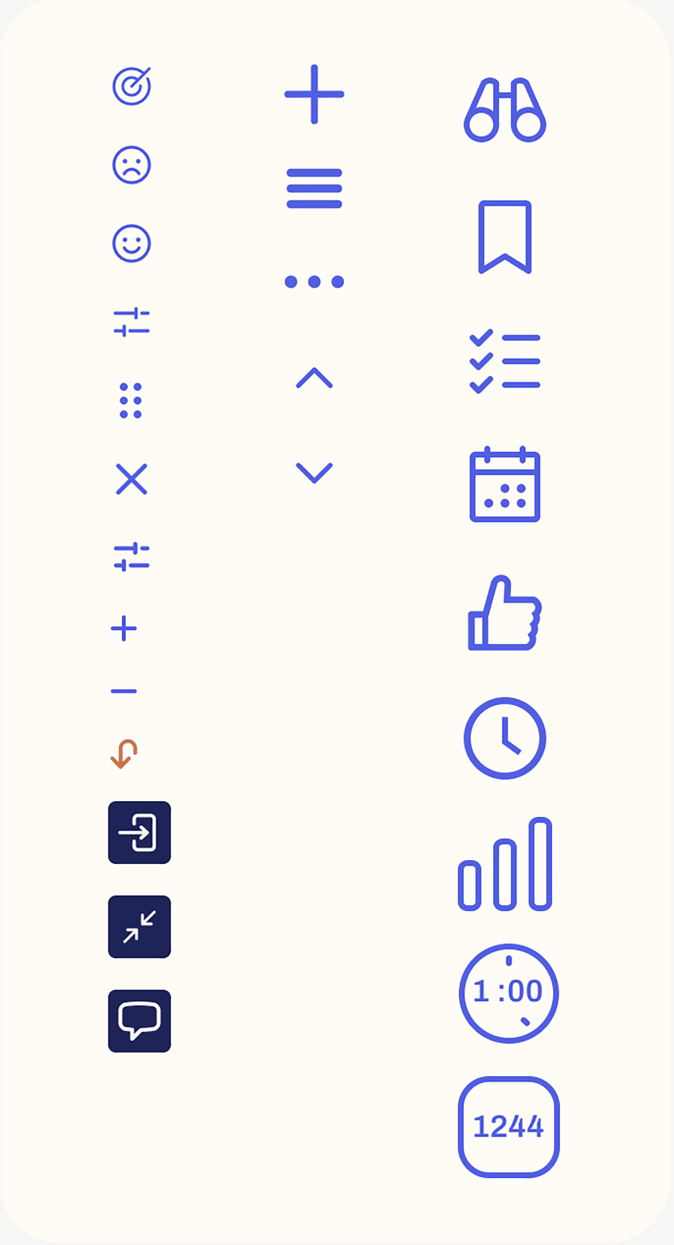
icons

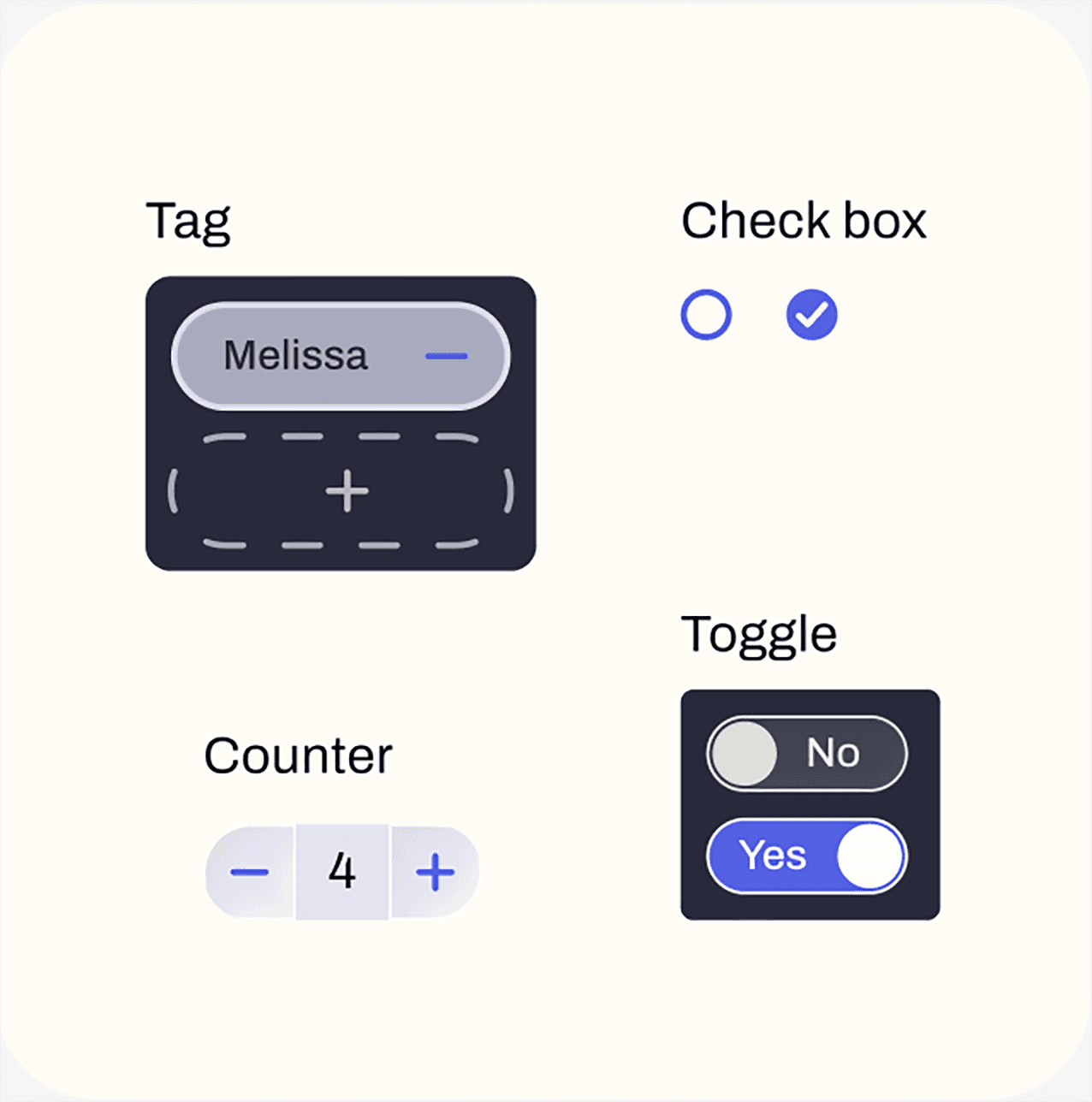
Selection tools
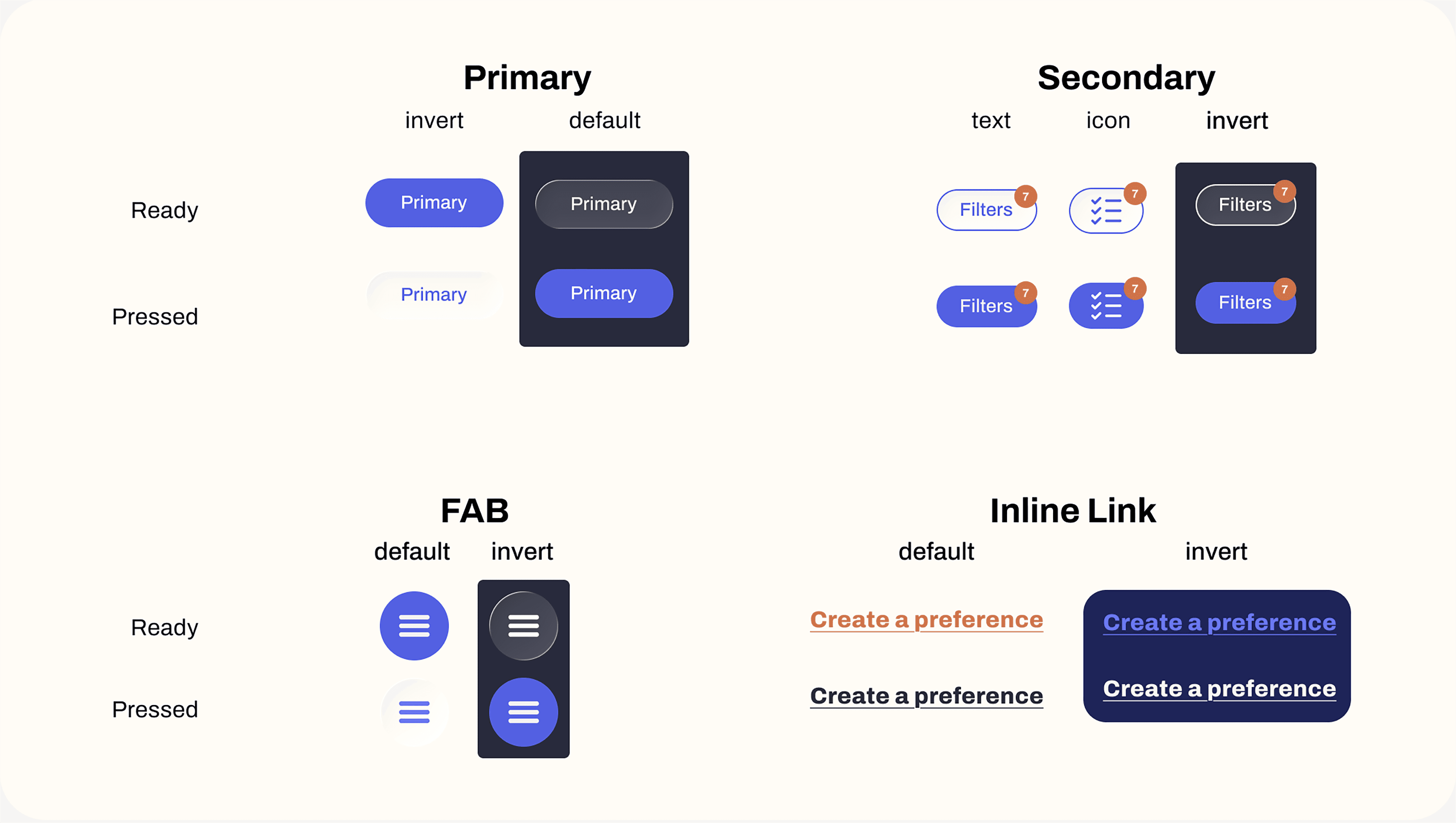
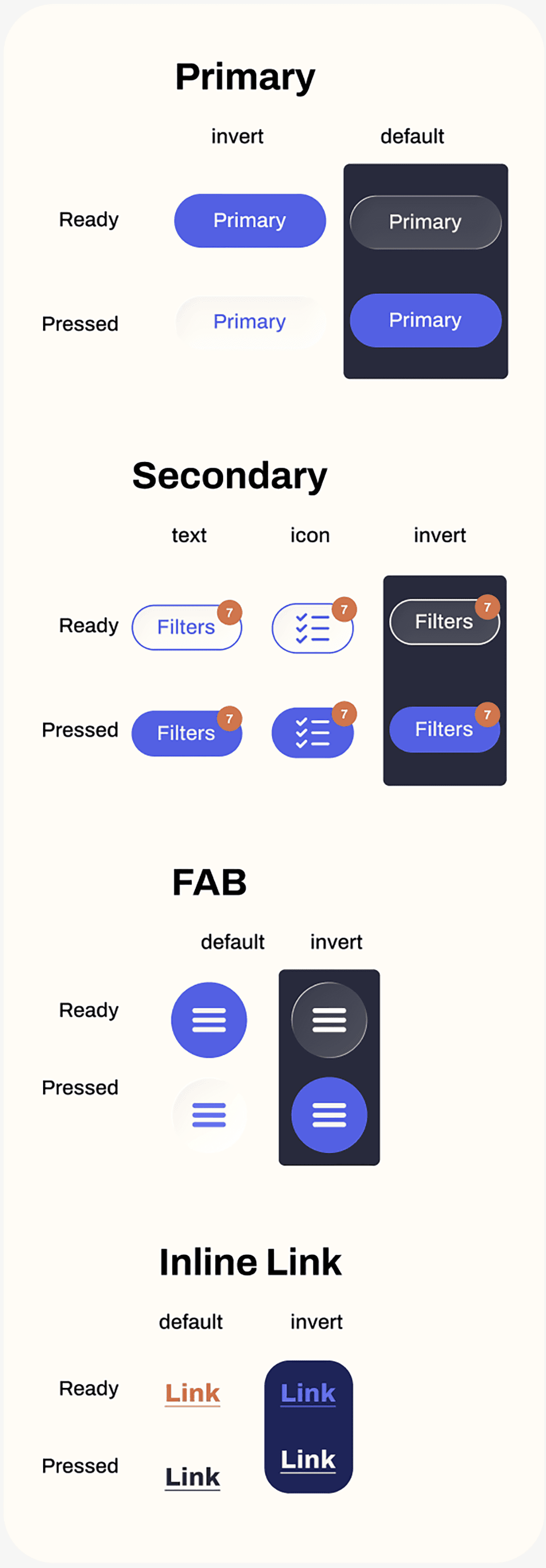
Buttons
Early Iterations
Before
After
One glaring difference is the change from illustrations to photographs. While illustrations can be informative, pictures are more effective in conveying information about the result of a recipe.
I ended up utilizing floating action buttons to access the main menu and Roo. This way, those two options continue to be consistent in location, but take up way less real estate than the bars across the bottom of the page.
Before
After
I decided to switch to full-page overlays when accessing features such as filters and chat with Roo. Using the full page allows for more negative space and temporarily blocks out information that's not relevant to the task at hand, both of which make it easier for the user to focus.
Before
After
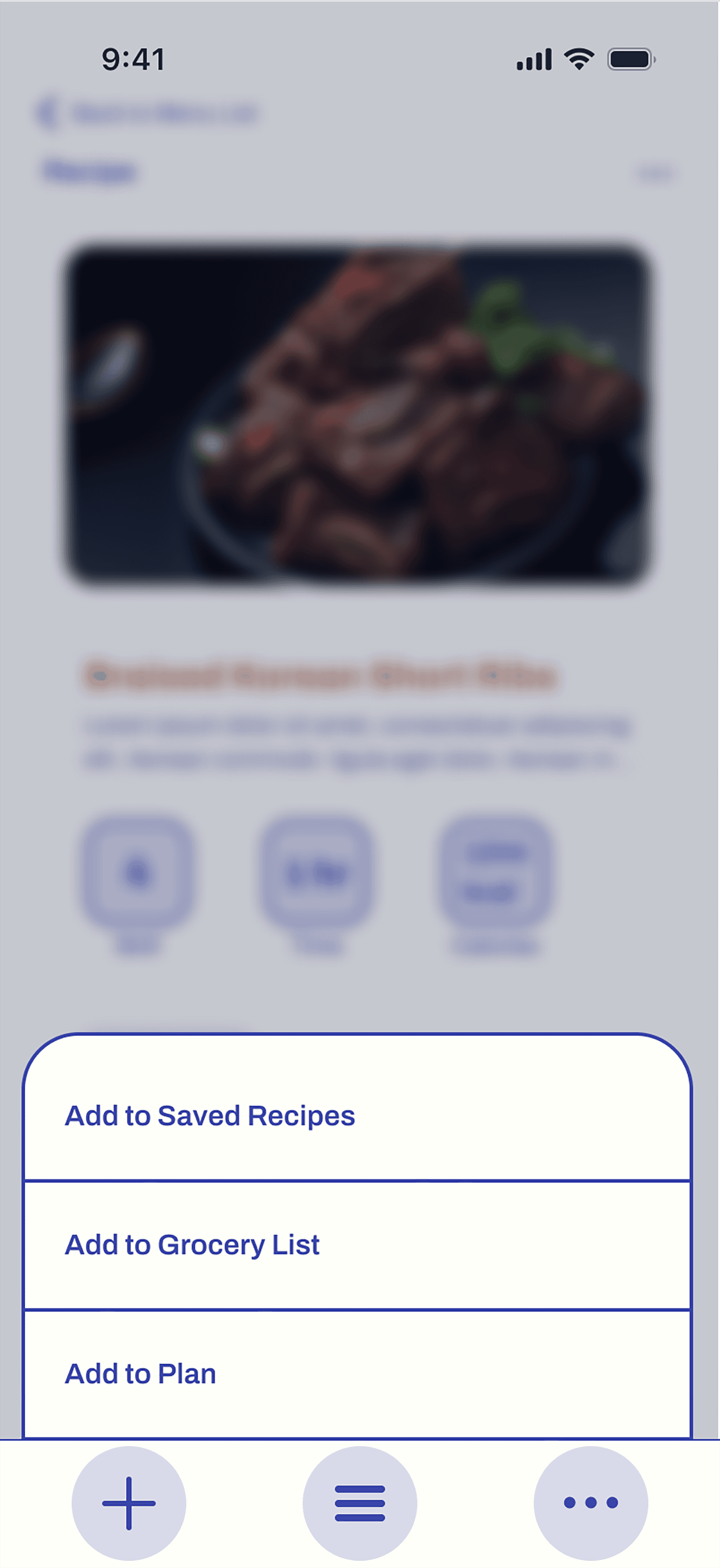
In the earlier version, the toolbar at the bottom of the screen adapted to the content on the screen, making tools available when needed. On the recipe screen, an "Add" button appeared where the user could find all the "Add tos" (for Saved, Grocery List, or Plan), all in one place.
In the latest design, the "Add to" options live within the content rather than in a toolbar. This is partly because the majority of the time, the bottom toolbar only had the solitary "Menu" icon. That is why the entire bar seemed to take up too much space, thus the FAB.
I could have created an adaptive floating bar, adding another button next to the "Menu" button when needed; however, some of the "Add to" options make more sense to have in proximity to matching content on the page. For example, it makes sense to be able to add to the grocery list right where the ingredients are listed.
Now, the option to add ingredients is right there in the ingredients list while the options to save the recipe and add it to the weekly plan live at the top of the page near the recipe title and image.