Timeline
Type:
Website
Tools:
Figma
Role:
Designer
This is a passion project exploring threads of design history through an interactive experience. I look at a favorite typeface and systems of universal communication, contextualized by time and historical events.
The story begins with the London Underground, then focuses on how design can be used to bring people together in an era tearing people apart, and finally highlights how communication design evolves with culture and technology.
Content-wise, the website boils down a very long story into a manageable, bite-sized edition to give typography and graphic design enthusiasts perspective on the historical impact on current design. In turn, I hope it influences the audience to consider the impact their designs may have on the future.
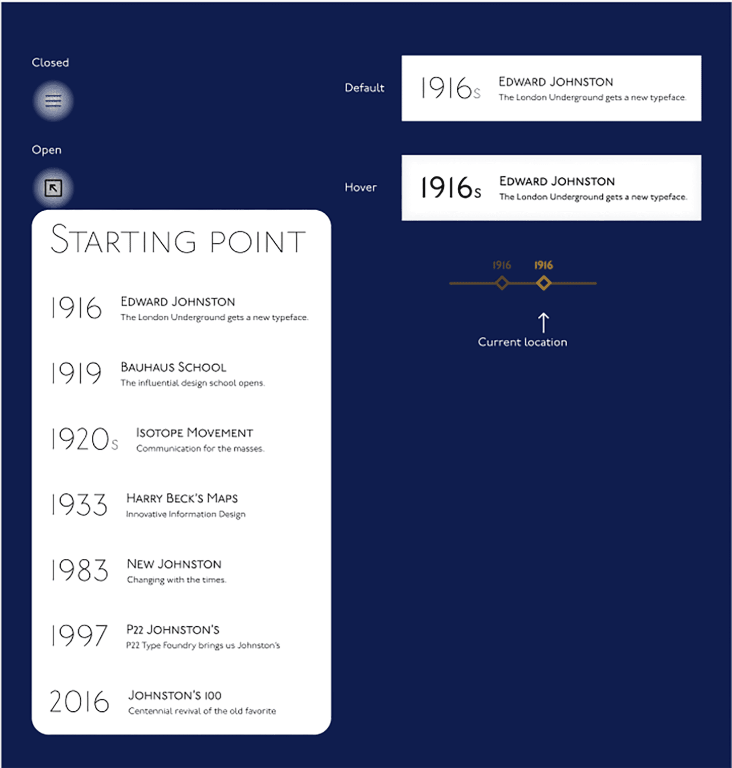
Practically, the design of this website was an opportunity to explore various methods for the user to navigate through the story. I wanted to provide the opportunity for the user to feel immersed in a continuous story. At the same time, it was important that the user be able to navigate where they wanted, when they wanted, without the friction of feeling stuck or confused.
Styles
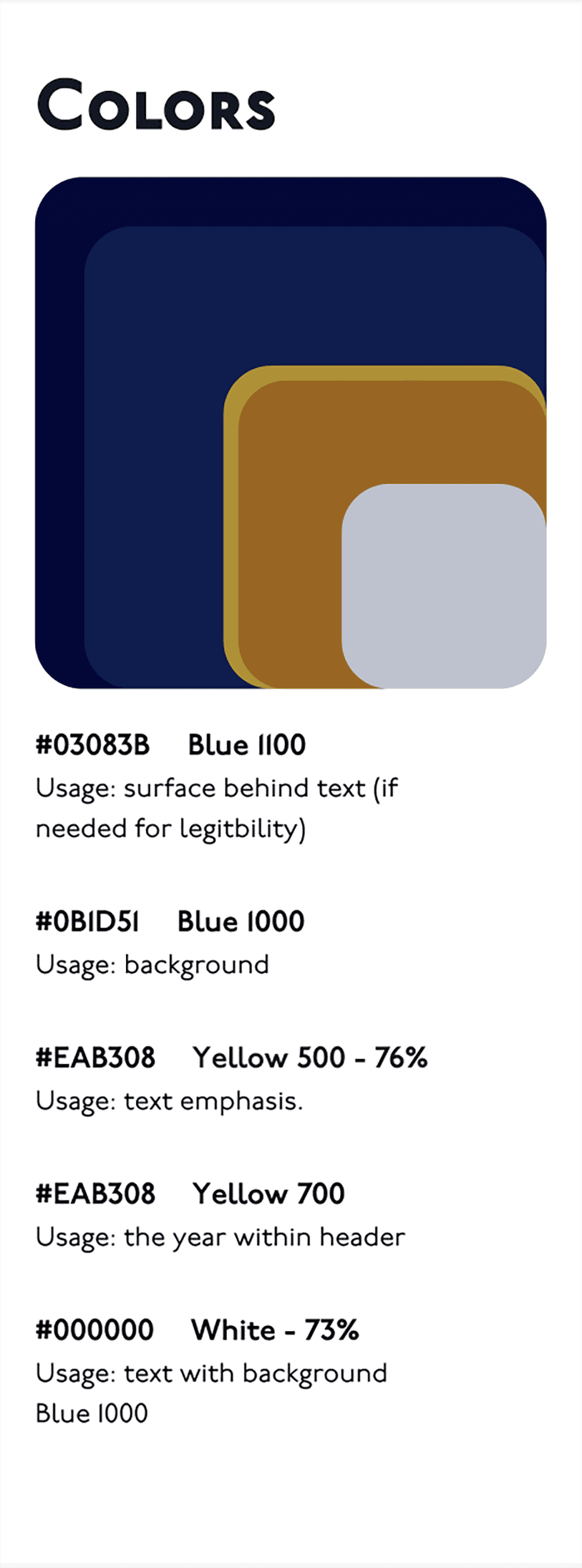
The color palette arose from a desire to modernize a relic from a past era, just as P22 has done with this typeface.
I started with the idea of using blue and orange/gold of moderate saturation, thinking of faded dark colors or the yellowing of old paper. But, to bring excitement, depth, and modernity to the scene, I instead opted for colors of high saturation, adjusting the opacity and blend mode of layers.
Components
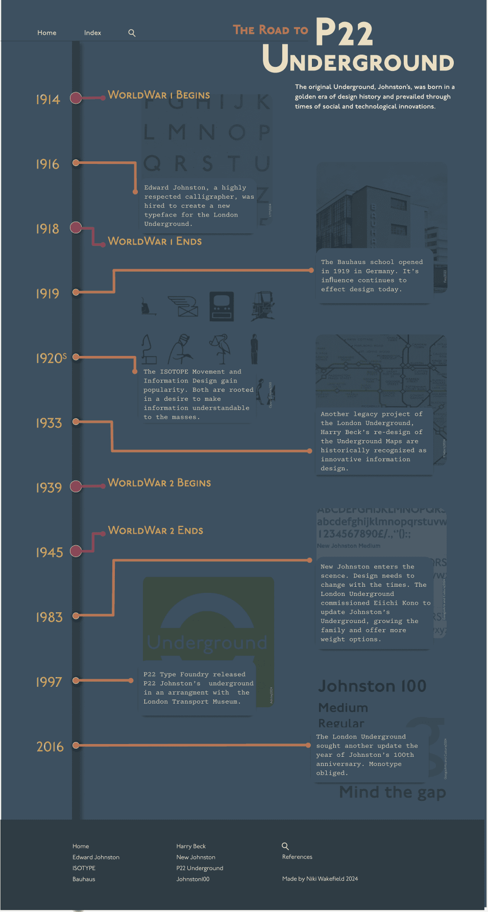
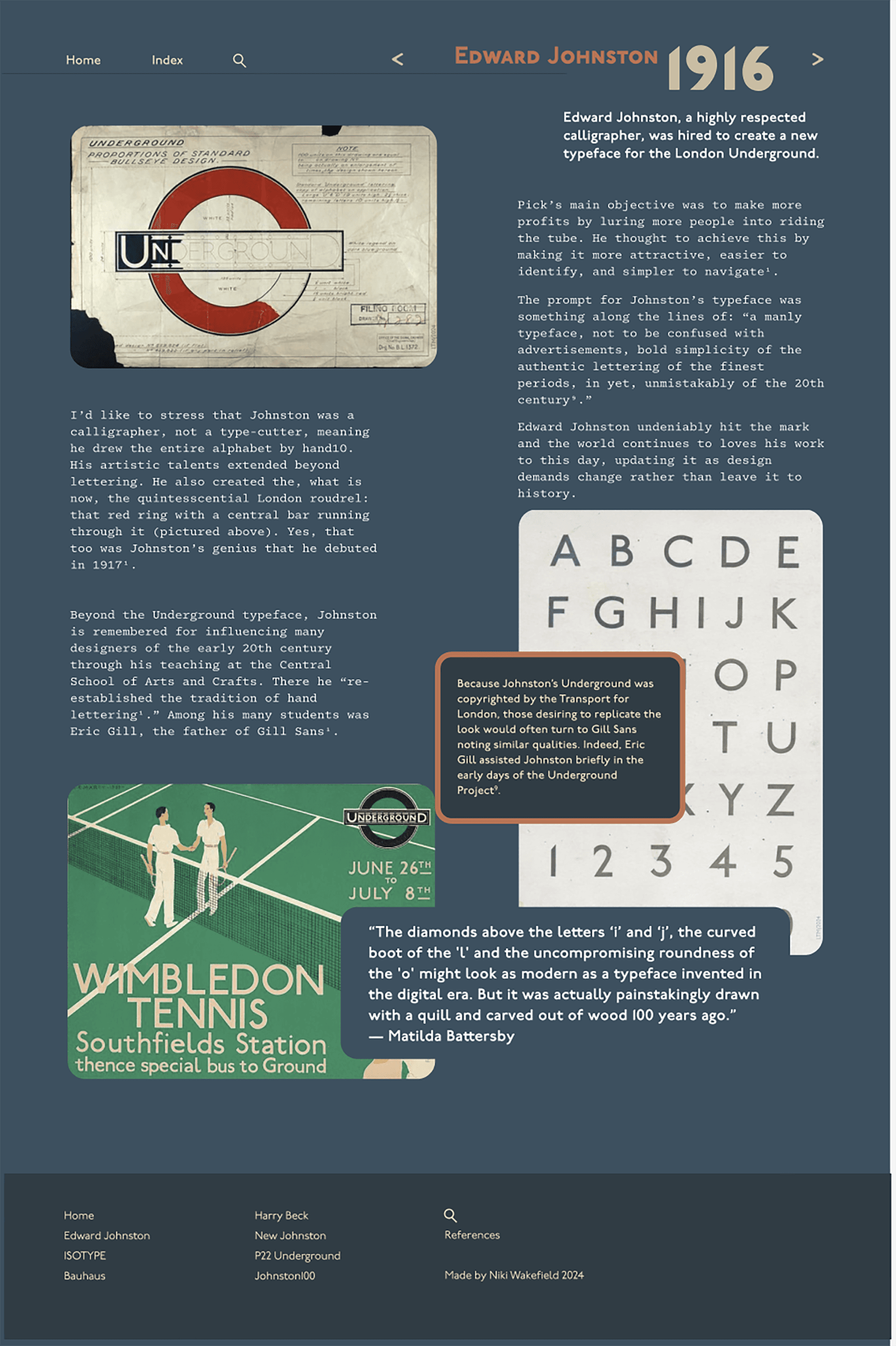
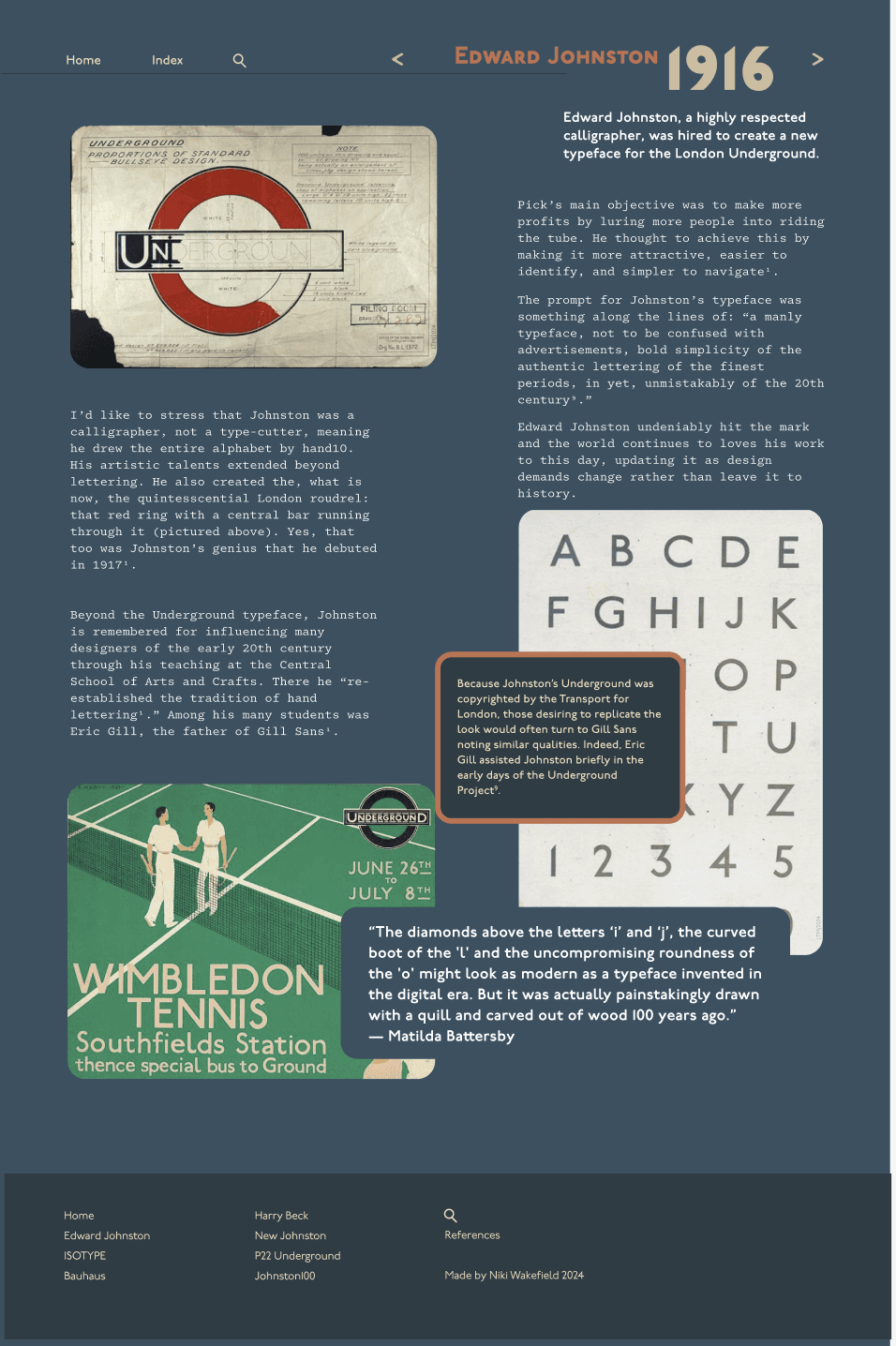
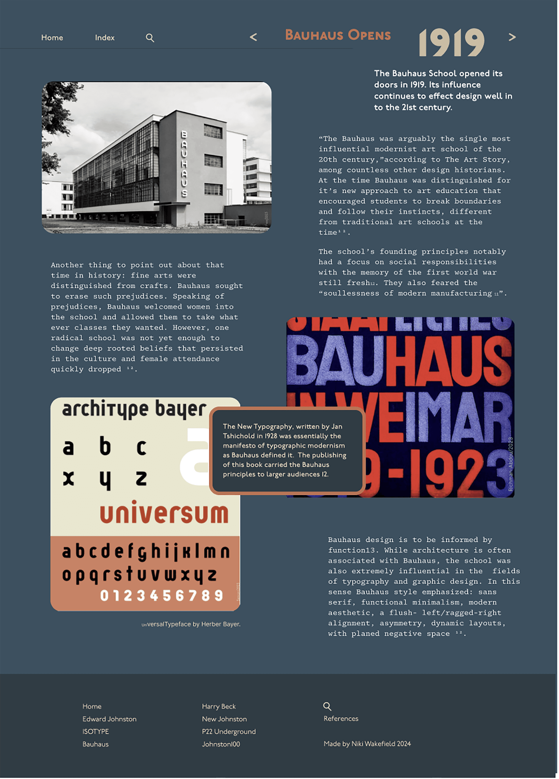
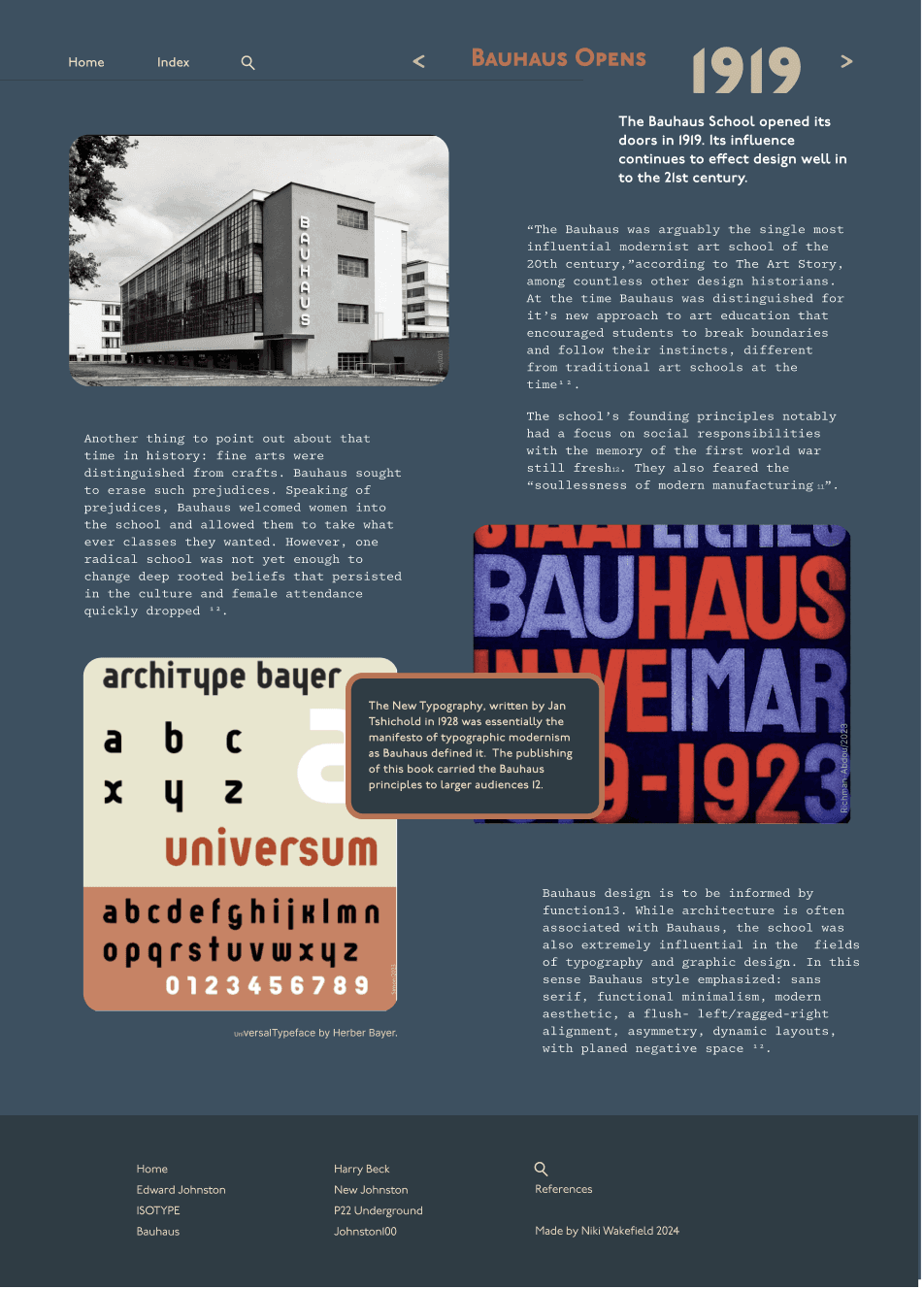
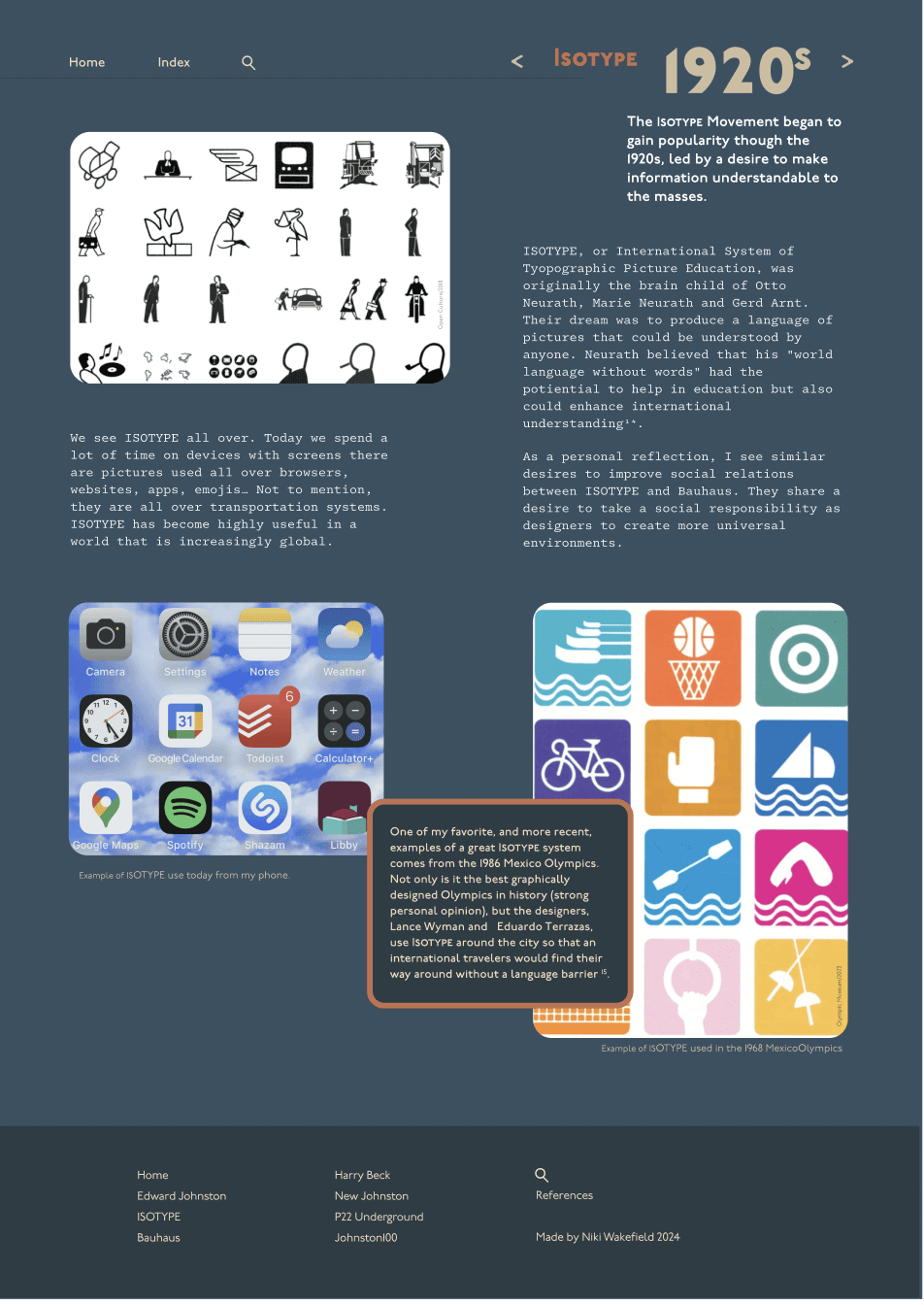
This earlier version shows a color palette that is more subdued, giving a more vintage and aged feeling to the content, to reiterate that the content is focused on past times.
The change in color ultimately arose because the page needed more contrast and depth.
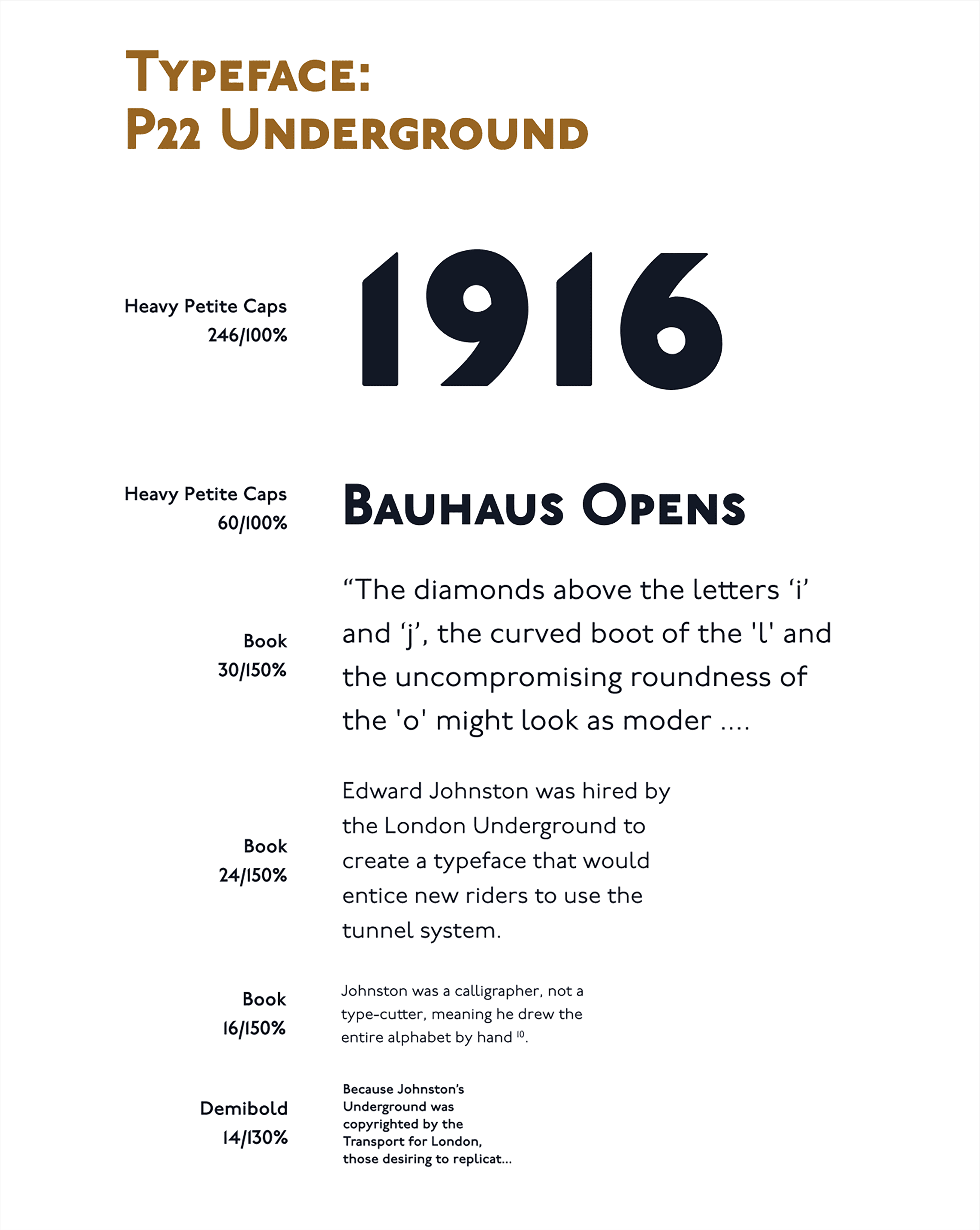
You may notice I introduced a second typeface for body copy in this version. On second thought, that felt ridiculous - the web page is focused on a typeface that offers enough versatility for any situation.
These pages had way too much body copy…apparently, people don't like to read anymore, so the new version has less text to be easier on the viewer's attention span.
The biggest change came with converting a multi-page site to one page, coupled with a swap from vertical scroll to horizontal. As mentioned above, that change is meant to create a more continuous, linear experience.


